F1 Team Logos: Evolution Through Decades
A concise history of how F1 team logos evolved from simple mid-century marks to minimalist, digital-first designs that balance heritage and modern branding.
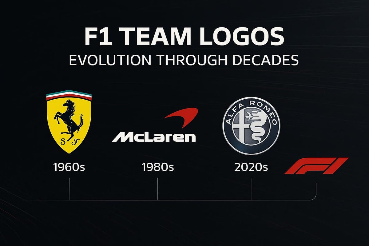
F1 team logos have evolved significantly over the decades, mirroring the sport's growth and adapting to design trends and technological demands. From simple, functional designs in the 1950s to sleek, digital-friendly branding today, these logos reflect Formula One's journey from a niche motorsport to a global entertainment powerhouse.
Key Highlights:
- 1950s–1980s: Basic, monochromatic designs prioritized clarity for print and early TV. Examples include Brabham's cobra logo and Williams' bold wordmark.
- 1994–2017: The iconic "F1" logo by Carter Wong introduced negative space to form the number "1", symbolizing speed and precision. However, it struggled with digital scalability.
- 2018–Present: A modern, minimalist red design emphasizes digital clarity and global appeal while maintaining F1's identity as a high-energy, fast-paced sport.
Each redesign reflects its era's priorities, balancing heritage with the need to stay visually relevant in an increasingly digital world.
1. 1950s-1980s Logos
Design Trends
During this era, team logos were all about keeping things simple and functional. Post-war printing limitations and the rise of modernist design pushed teams to use monochromatic or basic color palettes, clean typography, and geometric shapes. These choices ensured logos would stand out on race cars, uniforms, and printed materials. Take the Brabham logo, for example - it paired a vertical wordmark with a coiled cobra, a bold symbol of strength and danger. Williams Racing went for a minimalist wordmark in a block sans-serif font, splitting black and blue to highlight heritage and stability. Alfa Romeo leaned into its motorsport legacy with a script-style wordmark, underlined in the colors of the Italian flag and accompanied by a "Since 1910" tagline. The Arrows team used bold triangles in British flag colors to evoke national pride, while Toyota Racing incorporated the Toyota and Panasonic logos into a distinctive "T" shape, blending gray, blue, and red. These designs laid the groundwork for the major rebranding shifts that would come in the 1990s.
Consistency with Team Identity
These logos weren’t just about aesthetics - they were powerful tools for building team identity. The coiled cobra in Brabham's design symbolized aggression, while Williams’ consistent use of blue stood for reliability. Alfa Romeo’s incorporation of Italian flag colors emphasized its deep motorsport roots. These visual cues created instant recognition, making it easy for fans to connect with the teams, no matter their language or background.
Adaptation to Modern Platforms
As the sport evolved, so did the platforms where these logos appeared. Originally designed for print, many of these logos struggled to maintain their impact in digital formats. Intricate details that worked well on race cars often became hard to read or lost their punch when scaled down for screens. This shift highlighted the growing need for teams to rethink their visual identities, a challenge that would drive the rebranding efforts of the 1990s.
2. 1994-2018 Logos
Design Trends
The 1994 redesign marked a bold new chapter for Formula One's branding. Created by Carter Wong, this logo became one of the most iconic in sports history. It featured a slanted "F" with dynamic speed lines that ingeniously used negative space to form the number "1". This was a sharp contrast to the previous 1987–1993 logo, which was a simple black wordmark underlined in yellow and paired with an FIA badge.
The new design used a carefully chosen three-color palette: black to symbolize power and authority, red to convey energy and passion, and white to create the negative space that formed the "1". Together, these colors captured the spirit of Formula One - speed, precision, and engineering mastery.
The logo reflected broader trends in corporate branding during the 1990s, embracing minimalism and geometric design. Its clever use of negative space and the forward-leaning angles of the "F" gave a sense of motion and speed, perfectly aligning with modern sports branding of the time.
This design remained in use for 24 years - one of only three logos in Formula One's 67-year history - underscoring its lasting impact on F1 culture. Beyond being a visual identifier, this logo redefined the sport's image and solidified its branding for nearly a quarter-century.
Consistency with Team Identity
The 1994 logo didn't just stand out on its own; it also played a crucial role in unifying the visual identity of Formula One teams. While detailed records about how individual teams adapted their logos during this period are limited, the official F1 logo provided a strong and cohesive framework for the sport. This consistency helped establish a unified visual language, reinforcing the logo's central role in shaping Formula One's modern identity.
The widespread recognition of the 1994 logo ensured that it became a cornerstone of F1's branding, creating a shared aesthetic across teams and events.
Adaptation to Modern Platforms
As the digital era gained momentum, the 1994–2018 logo faced new challenges. While it excelled in traditional media like television broadcasts, print, and merchandise, it struggled to adapt to digital platforms. The intricate details, such as the dynamic speed lines, often lost clarity when scaled down for social media icons, mobile apps, or small digital screens.
The black, red, and white color scheme worked beautifully in print and on race cars, but on digital displays, the contrast and legibility sometimes suffered. As Formula One expanded its digital presence to attract younger audiences, the limitations of a logo designed for older media formats became more apparent. By the mid-2010s, it was clear that a new visual identity was needed - one that could thrive in the fast-evolving digital landscape.
Despite these challenges, the 1994 logo left an indelible mark. Its clever use of negative space and dynamic design elements made it stand out among sports logos worldwide, earning it recognition as one of the most imaginative and memorable brand images in history.
3. 2018-Present Logos
Design Trends
The 2018 logo redesign marked a pivotal moment for Formula One, reshaping its visual identity to reflect the sport's evolution under Liberty Media's ownership. Tasked with this transformation, Wieden+Kennedy London created a logo that mirrored F1's shift toward becoming a global entertainment powerhouse. Remarkably, this was only the fourth major logo update in the sport's 68-year history.
The new design embraces a minimalist and geometric approach. It features a forward-leaning red "F" paired with a diagonal "1", with softened corners that create a sleek, fluid silhouette. This design moves away from the intricate negative-space details and dynamic speed lines of earlier logos. A custom typeface with bold bars, sharp edges, and an elongated upper stroke adds a sense of motion and energy. Bright red dominates the color scheme, symbolizing passion, energy, and the high-stakes intensity of championship racing. This vibrant palette also ensures a strong visual presence across digital platforms and social media.
This redesign aligns with broader trends in sports branding, where clean lines and bold geometric shapes take precedence over ornate designs. The result is a universal visual language that communicates movement and modernity. These updates not only define F1's corporate identity but also provide a framework for teams to adapt their own logos while maintaining their individuality.
Consistency with Team Identity
Despite the shift toward a unified and modern branding approach, individual F1 teams have retained their unique identities. For instance, Alfa Romeo's logo features a script-style wordmark with a distinctive uppercase "R" and a lowercase "A", underscored by a line in the colors of the Italian flag and accompanied by the tagline "Since 1910". Similarly, the Brabham logo, with its vertical lettering and coiled cobra design, conveys a sense of strength and danger.
To stay relevant in the digital age, teams have adopted cleaner, more streamlined designs that align with F1's updated aesthetic. Simplified typography and enhanced scalability ensure their logos remain impactful across digital platforms. While embracing modern trends, teams have preserved their unique characteristics, creating a balance between individuality and the sport's contemporary branding vision.
Adaptation to Modern Platforms
One of the central goals of the 2018 redesign was optimizing F1's visual identity for digital platforms. The minimalist red logo was crafted for clarity, ensuring it remains sharp and recognizable on small screens, social media icons, and streaming broadcasts. Its custom typeface and geometric design maintain legibility even when scaled down. The bright red color enhances visibility and contrast, allowing the logo to stand out against various backgrounds and lighting conditions. Meanwhile, the softened corners contribute to a fluid look that works seamlessly across digital graphics, race car liveries, and merchandise. Black and monochrome variations provide flexibility for different branding contexts.
This rebranding effort has not only modernized F1's commercial presence but also expanded its global appeal. By focusing on digital optimization, F1 has strengthened its ties with luxury and lifestyle brands while appealing to a broader audience, including younger, tech-savvy fans. The updated visual identity reflects F1's blend of innovation and tradition, ensuring the sport stays relevant in a rapidly changing world.
Evolution of Formula One Logo + Hidden Messages Behind It
Strengths and Weaknesses
Each era of F1 logos brings its own set of advantages and challenges. By examining these trade-offs, we can see how Formula 1's visual identity has evolved over time, adapting to new demands while holding onto its core essence. This journey reflects the sport's transformation from basic insignias to sleek, digital-ready symbols.
The 1950s–1980s era prioritized simplicity. Logos from this period featured clean typography and minimal design, making them easy to reproduce in print and on early television screens. This straightforward approach worked well for physical signage, but it fell short in capturing the speed, innovation, and cutting-edge technology that define Formula 1. These designs, while functional, lacked personality and flair.
The 1994–2017 era took a bold leap forward in sports branding. The Carter Wong design introduced a clever use of negative space, with the slanted "F" and speed lines forming the number "1" in the white space. This dual-tone design had immediate visual impact, combining sharp lines and bold typography for a modern, professional look that resonated globally. However, as digital platforms grew, the intricate details of this design became problematic at smaller sizes, such as social media icons or mobile app thumbnails.
The 2018–present era embraces the needs of the digital age with a sleek, minimalist design. The bold, forward-leaning red "F" with softened edges ensures clarity on everything from large stadium screens to tiny smartphone displays. This adaptability allows the same logo file to work seamlessly across various platforms, eliminating the need for format-specific adjustments. However, some fans view this update as overly corporate, favoring practicality over the creative ingenuity of past designs. These shifts highlight how F1's branding reflects its broader evolution.
| Logo Era | Key Strengths | Primary Weaknesses | Platform Performance |
|---|---|---|---|
| 1950s–1980s | Clear and simple; easy for print reproduction | Lacked dynamism; failed to convey speed and innovation | Poor adaptability to digital platforms |
| 1994–2017 | Clever negative-space design; modern and bold look | Lost clarity at smaller scales; details became unclear | Strong for print, less effective digitally |
| 2018–Present | Digital-friendly; clear at any size; versatile | Seen as less imaginative; leans toward a corporate tone | Excellent across all digital platforms |
These differences highlight how F1 has balanced its heritage with the demands of modern branding.
Team logos have followed a similar trajectory, evolving alongside the sport's overall branding. In the early decades, teams had significant creative freedom, operating without a unified F1 branding system. With the 1994 redesign, team logos began aligning more closely with a branding language that emphasized speed and precision. The 2018 Liberty Media era introduced structured brand guidelines, creating consistency with the official F1 identity while still allowing teams to maintain their unique identities.
F1's commercial growth has also influenced logo design priorities. During the 1950s–1980s, limited sponsorships and smaller budgets led to simpler designs. As sponsorships grew in the 1990s and 2000s, logos started incorporating sponsor elements, which often resulted in visual clutter. The 2018–present era, driven by Liberty Media's focus on global entertainment and digital merchandising, has seen a shift toward cleaner, more scalable logos. These designs are better suited for licensing and merchandise, as well as digital platforms like video games and international markets.
The ongoing challenge in F1 branding lies in balancing consistency with creative evolution. A consistent visual identity helps reinforce team heritage and build brand equity - something Ferrari has mastered. At the same time, logos that remain too static risk feeling outdated. The most effective modern rebrands strike a balance, preserving key elements like colors, typography, and symbolic references, while updating designs to meet current digital and aesthetic standards. This approach ensures logos stay relevant in an ever-changing visual landscape while maintaining their connection to the sport's rich history.
Conclusion
The evolution of F1's logo strikes a fine balance between honoring its heritage and embracing modernity. Since its inception in 1950, the sport has seen only four major logo updates, a deliberate strategy that has helped cement its place as one of the most iconic visual identities in global sports.
The journey from the early, straightforward blue wordmark to the bold, minimalist red design of today reflects F1's transformation from a European motorsport into a worldwide entertainment powerhouse. Each redesign has aligned with pivotal commercial milestones, signaling shifts in the sport's global presence and digital evolution. These updates have not only marked key moments in F1's history but also maintained a cohesive visual narrative that strengthens its identity.
F1's consistent visual language - rooted in themes of speed, power, and precision - bridges its past and present, showcasing the sport's progression from traditional racing to a cutting-edge entertainment platform. From the forward-leaning typography of the 1994 logo to the sleek red "F" we see today, the designs have always conveyed a sense of velocity and technological sophistication. The 1994 logo, which remained in use for 24 years, became a cultural touchstone for fans, demonstrating the enduring emotional power of thoughtful design.
FAQs
How have technological advancements shaped the evolution of F1 team logos over time?
Technological progress has profoundly influenced the evolution of F1 team logos. With the rise of advanced design tools and digital technologies, teams now craft logos that are sharper, more dynamic, and aligned with contemporary branding trends. For instance, modern graphic design software allows for intricate detailing, gradients, and even 3D effects - features that were simply out of reach in earlier decades.
The move to digital platforms, like social media and online streaming, has also shaped logo design. Logos now need to be versatile enough to look great on everything from race cars and merchandise to smartphone screens. By ensuring their logos are clear and impactful across various screen sizes and resolutions, F1 teams are keeping their branding relevant in today’s digital-first world.
What made the 1994 F1 logo by Carter Wong so iconic, and how did it adapt to the digital age?
The 1994 F1 logo, crafted by Carter Wong, stands out as a hallmark of sports branding. Its clean, streamlined design brilliantly embodied the essence of Formula One - speed and precision. The bold typography and energetic composition made it instantly memorable, resonating with fans across the globe.
That said, as technology advanced and digital platforms became more dominant, the logo encountered some hurdles. Its detailed features didn’t always translate well to smaller screens or digital formats, occasionally losing clarity and impact. These challenges eventually led to updates, ensuring the logo stayed visually strong and effective in the digital age.
Why did Formula One adopt a minimalist design for its logo in 2018, and how has it influenced the sport's global branding?
The 2018 redesign of the Formula One logo took a simpler, sleeker approach to keep up with modern branding trends and work better in digital spaces. The old logo, while memorable, was more intricate and didn’t translate as well on platforms like mobile apps or social media. The updated version focuses on clean lines and clear visuals, making it easy to recognize no matter where it appears.
This change has boosted Formula One's global identity by aligning with current design preferences and connecting with a younger, more tech-savvy audience. The fresh logo also reflects the sport’s progressive mindset, ensuring it remains relevant in today’s fast-paced entertainment world.

