How Driver Performance Evolves Over Seasons
Explore how to evaluate driver performance in Formula 1 by analyzing metrics, external factors, and trends over multiple seasons.

Driver performance in Formula 1 goes beyond wins and points. It’s shaped by factors like car development, team dynamics, and changes in regulations. To truly evaluate a driver’s growth, here’s what matters:
- Key Metrics: Analyze points per race, qualifying gaps, and teammate comparisons to isolate skill.
- Statistical Models: Use tools like regression analysis to separate driver ability from car advantage.
- Seasonal Trends: Track career arcs - improvement, peak, and decline - using multi-season data.
- External Factors: Account for team resources, car upgrades, and rule changes that impact results.
Understanding these elements requires structured data, smoothing techniques like rolling averages, and clear visualizations such as line graphs or scatter plots. By focusing on long-term trends and minimizing anomalies, you can uncover a driver’s true performance trajectory.
Key Metrics for Measuring Driver Performance
Core Performance Indicators
Evaluating a driver's growth requires more than just tallying up wins or standings. Metrics like points per race offer a steadier benchmark, especially when season lengths differ, providing better context. Qualifying performance is another valuable indicator, often showcasing raw driver skill. Comparing a driver's average qualifying position to their teammate's can help minimize the impact of car performance differences. Similarly, head-to-head comparisons within the same team can shed light on individual talent and adaptability, as teammates operate with nearly identical equipment. Analyzing race pace through sector times and lap-by-lap data uncovers patterns of consistency that reflect a driver's evolving racecraft, while stats on overtaking and defensive moves highlight their tactical growth over the season.
Why Statistical Modeling Matters
Raw numbers don’t always tell the whole story because factors like car development and team strategy heavily influence outcomes. This is where normalized scoring systems and percentage-based metrics come into play, offering a more balanced view. For instance, examining the time gap to pole position instead of just final grid positions can provide a clearer picture of performance gains. Advanced tools like expected performance models and regression analysis can filter out external variables - such as weather, track conditions, or team strategy - allowing for a more accurate assessment of a driver's true progress.
Tracking Performance Over Multiple Seasons
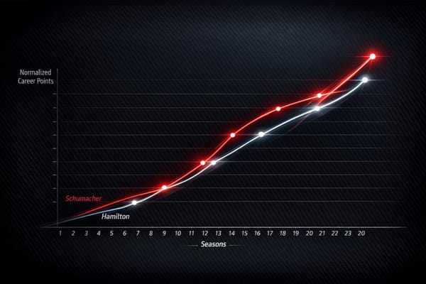
Looking at performance across several seasons reveals trends that single-season stats often miss. Drivers typically experience a career arc: rapid improvement in the early years, a peak phase, and eventual decline. Identifying these phases is crucial for understanding shifts in performance. For example, younger drivers may show significant gains in qualifying speed, while seasoned drivers often excel at refining race management. Techniques like multi-season rolling averages help smooth out anomalies caused by rule changes or team dynamics. This approach not only highlights long-term trends but also shows how quickly drivers adapt to new cars, regulations, or team setups. These broader trends set the stage for more structured data collection, which is explored next.
Collecting and Organizing Seasonal Data
Finding Reliable Performance Data
Start by tapping into dependable sources like the FIA's official timing system and team technical reports. The FIA's timing and scoring system is your gold standard, providing precise lap times, sector breakdowns, and qualifying results - essential for tracking performance. Many teams also release end-of-season technical summaries, which shed light on car development and strategic decisions that shaped driver outcomes.
Telemetry data is ideal, but access is limited. While full telemetry remains exclusive to teams, broadcasters like ESPN and NBC Sports often share select data points during race coverage. These include speed trap readings, brake temperatures, and tire wear patterns - valuable for building trend analyses. Even small snippets of telemetry can help uncover meaningful insights.
Third-party data aggregators have also stepped up their game. These services compile historical F1 stats, offering downloadable datasets that span decades. They often include details like weather conditions, track temperatures, and changes in technical regulations. However, when dealing with older seasons, cross-checking is essential since digital record-keeping was less consistent back then. Once you’ve gathered reliable data, the next step is to organize it for deeper analysis.
Organizing Data for Analysis
A structured approach is key to meaningful analysis. The most effective frameworks organize data by season, then drill down into driver performance, team results, and car specifications. This layered structure makes it easier to filter and compare across different time periods and scenarios.
For smaller datasets, tools like Excel or Google Sheets work fine. But for analyzing multiple seasons or larger datasets, statistical software becomes indispensable. Key metrics to track include race finishes, qualifying gaps to pole, points scored, and teammate comparisons. Adding context - like weather conditions, mechanical failures, and strategic choices - gives a fuller picture of performance.
Database normalization is critical for fair comparisons, especially across eras with different rules. For example, when the points system shifted in 2010 from 10-6-4-3-2-1 to the current 25-18-15-12-10-8-6-4-2-1, raw points alone became less useful. To ensure fairness, you’ll need to create normalized scoring systems that adjust for these changes. Once the data is structured, smoothing techniques help uncover underlying trends.
Using Averages to Smooth Data
After organizing your data, smoothing techniques help cut through the noise and reveal true performance trends. Raw data often includes anomalies - like mechanical failures or unusual track conditions - that can distort the picture. Rolling averages are a great way to filter out these outliers. A five-race rolling average strikes a good balance, capturing real changes while maintaining stability against random fluctuations.
Median calculations are another useful tool. For instance, if a driver scores points in four races but has a DNF in the fifth, a median provides a clearer sense of their performance than a simple average. This method is particularly helpful for qualifying data, where one bad session due to rain or technical problems can skew the numbers significantly.
Timing matters when applying smoothing techniques. Early-season data often reflects teams and drivers adapting to new cars or regulations. Mid-season results typically showcase peak performance levels, while late-season trends may highlight the impact of championship pressure or reduced focus from teams no longer in contention. By tailoring your smoothing techniques to these phases, you can uncover subtle patterns in driver and team performance that might otherwise go unnoticed.
Measuring Driver Improvement Across Seasons
Tracking Year-Over-Year Performance Changes
To evaluate how a driver improves over time, compare key metrics from one season to the next. Qualifying performance is a solid baseline for this analysis since it's less influenced by variables like race strategy, pit stops, or traffic. Tracking the average gap to pole position across seasons can provide insight into a driver's pace and whether it's improving.
In addition to qualifying, look at per-race points and finishing percentages to measure consistency and progress. Be sure to account for differences in the points system and the number of races in each season, as these can skew direct comparisons.
Consistency is another crucial factor. For instance, two drivers might have similar average finishes, but the one with fewer fluctuations in race positions demonstrates greater reliability. These trends can also be compared to a driver's teammate to better understand individual performance.
Comparing Performance Against Teammates
Teammate comparisons are a great way to isolate a driver's skill from the performance of their car. If a driver starts off lagging behind their teammate in qualifying but closes the gap over time, that’s a clear sign of improvement. On race days, focus on events where both teammates finish without major disruptions - like mechanical failures or poor strategy decisions - to get a clearer picture of their relative performance.
Driver swaps during the season can also offer valuable insights. When a new driver steps into a car mid-season, their results under the same conditions can highlight differences in skill and adaptability. These comparisons provide a more detailed understanding of a driver's progress when viewed alongside seasonal trends.
Mapping Career Performance Curves
Looking beyond seasonal data, mapping a driver’s career trajectory can reveal their long-term development. Most drivers follow a pattern: rapid improvement as rookies, a peak performance phase lasting several seasons, and eventually a plateau or decline influenced by various factors like injuries or rule changes.
Peak years often represent the period when a driver achieves their best results, with consistent high performance across key metrics. A plateau, on the other hand, signals that the driver’s learning curve has leveled off, with little to no improvement from season to season.
Declines, however, vary greatly. Some drivers lose qualifying pace gradually, while others maintain their speed but struggle with race-day challenges like tire management or strategy. An increase in inconsistent race results is often an early sign of decline.
External factors also play a role in shaping these career curves. Injuries, team changes, or adapting to new regulations can disrupt a driver’s trajectory. However, these same factors - like switching to a new car or adjusting to technical rule changes - can sometimes reignite improvement, altering what might otherwise be a predictable career path.
Analysing Formula 1 Data with Ex F1 Engineer - 2022 Bahrain and Jeddah
External Factors Affecting Performance Development
When evaluating a driver's performance over multiple seasons, it's important to remember that raw stats - like lap times, qualifying positions, and race results - can be shaped by more than just individual talent. External factors often play a big role, making it crucial to separate genuine progress from variations caused by outside influences. Let’s dive into the key areas where these external factors come into play.
Team and Car Development Effects
A driver’s performance is often tied closely to the capabilities of their car. Teams with larger budgets typically have access to advanced testing, cutting-edge upgrades, and faster pit stops, giving their drivers a significant edge. On the flip side, even the most skilled drivers can struggle to deliver results if their car falls behind in development.
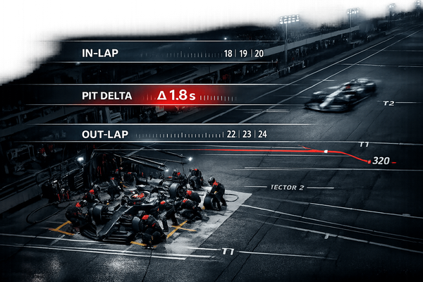
Team strategy also plays a big role. Improved pit stop efficiency, smarter race tactics, and better tire management can all lead to better results - though these gains don’t necessarily reflect a driver’s skill. In short, the team’s resources and decisions can heavily influence a driver’s stats.
How Regulation Changes Affect Performance
Changes in racing regulations can shake things up, impacting both teams and drivers. New rules often mean adjustments to car design and aerodynamics, which can temporarily throw off performance data. Drivers may need time to adapt their techniques to these changes, leading to short-term fluctuations in results. These periods of adjustment can mask a driver’s true capabilities as the entire field works to find its footing.
Team Changes and Driver Adaptation
Switching teams is another major factor that can affect a driver’s performance. Moving to a new team means adapting to a different car, new team dynamics, and unfamiliar practices - all of which can lead to immediate performance shifts. These changes don’t always reflect a driver’s actual skill level but rather the challenges of adjusting to a new environment.
For instance, a driving style that worked perfectly with one car might not suit another, making the same driver look better or worse depending on the team. Beyond technical factors, elements like contract stability and team relationships can also influence how a driver performs. Recognizing these adaptation periods is crucial to identifying whether a driver is genuinely improving or just navigating transitional hurdles.
Creating Charts and Graphs for Performance Trends
Once you've gathered your data, the next step is turning those numbers into visuals that are easy to understand. Charts and graphs not only make your analysis look polished but also help you uncover patterns that might not be obvious in raw data. Plus, they make it easier to share insights with others.
Building Effective Charts and Graphs
Different types of charts serve different purposes, so choosing the right one is key. For instance, line graphs are perfect for tracking changes over time. They're great for showing how a driver's qualifying positions or lap times have shifted over several seasons. You can even plot multiple drivers on one graph to compare their trajectories.
Bar charts, on the other hand, work well for side-by-side comparisons. Whether you're looking at total points, podium finishes, or average finishing positions, bar charts make it simple to highlight differences at a glance.
Then there are scatter plots, which are ideal for spotting outliers and relationships between two variables. For example, you could plot qualifying positions against race results to see which drivers tend to outperform their starting spots - or to identify races with unusual outcomes.
In April 2025, Honda Racing Corporation and F1 Alpha Tauri Team adopted LightningChart technology for their motorsports analytics. This tool can handle over 16 billion data points in real time while maintaining high frame rates, making it a powerhouse for data visualization in competitive environments.
For most analysts, though, simpler tools like Tableau are more than enough. Tableau's drag-and-drop interface makes it easy to create professional visuals without advanced coding skills.
For those who prefer coding, Python libraries like Matplotlib and Pandas offer endless customization options. For example, in November 2023, Raul Garcia used these tools to dive into Sergio Perez's 2023 Formula 1 season. With BeautifulSoup for web scraping, Pandas for data handling, and Matplotlib and Seaborn for visualization, he created detailed charts showing Perez's points scored in each race.
Creating Tables for Detailed Comparisons
While charts are great for spotting trends, tables let you dig into the numbers with precision. They’re especially helpful for comparing specific metrics across seasons or drivers.
For example, you could create tables that track year-over-year improvements in key stats like qualifying averages, race finishes, and points per race. This provides a clear picture of a driver's growth over time.
Tables are also excellent for analyzing teammate performance gaps. By comparing average qualifying times, finishing positions, and championship points, you can better assess individual performance while accounting for car differences.
For comparisons across different eras, tables can normalize data to account for changes in point systems or race schedules. Adding notes about major regulation changes or team switches can help explain fluctuations in performance.
To keep tables easy to read, focus on 4–6 key metrics and use clear headers. Round numbers appropriately - lap times to three decimals and percentages to one decimal - so they're accurate but not overwhelming. These details make your analysis both precise and accessible.
Following US Formatting Standards
Consistent formatting is crucial for a polished analysis. Use the MM/DD/YYYY format for all dates. For example, the Monaco Grand Prix on May 26, 2024, should appear as 05/26/2024.
When dealing with numbers, use commas for thousands (e.g., 1,000) and periods for decimals (e.g., 3.14). For large figures like budgets, simplify them to something like $145.6 million instead of $145,600,000.
If you’re discussing temperatures, stick to Fahrenheit. For instance, refer to track conditions as 95°F rather than 35°C. While Formula 1 often uses metric units like kilometers and km/h, these are widely understood by US audiences in the context of the sport.
Pay attention to color choices in your visuals. Avoid relying solely on red and green, as these can be hard to distinguish for readers with color vision deficiencies. Instead, opt for contrasting colors like blue and orange, or use patterns and shapes to differentiate data. This is especially important considering that around 8% of men and 0.5% of women experience some form of color vision deficiency.
Finally, ensure your visuals are transparent and honest. Include actual data points alongside averages, and use error bars when presenting modeled predictions. This approach builds trust and strengthens the credibility of your analysis.
Conclusion: Understanding Driver Performance Patterns
Analyzing driver performance is a blend of precise metrics, reliable data, and clear visual representation. The techniques outlined here equip you to go beyond surface-level observations and uncover deeper insights.
Start with foundational metrics like qualifying results, race finishes, and points scored. Then, use statistical models to distinguish a driver’s skill from external influences. Evaluating performance against teammates and factoring in car development cycles helps pinpoint genuine growth versus temporary fluctuations. This approach can also help you recognize rising talent before it becomes widely apparent.
Organized data frameworks are key to identifying patterns. Consistent datasets reveal long-term trends, while averaging techniques smooth out the impact of one-off race incidents or unusual conditions. These methods ensure your analysis stays focused on the bigger picture.
Visual tools are essential for interpreting and communicating data. Line graphs are great for tracking performance changes over time, while bar charts and scatter plots highlight specific comparisons and relationships. To maintain professionalism, remember to use US formatting standards for dates (MM/DD/YYYY), numbers (with commas for thousands), and temperatures (in Fahrenheit).
Effective analysis combines numbers with context. While raw data is important, understanding factors like team dynamics, rule changes, and career transitions adds depth to your findings. This approach doesn’t just explain what happened - it helps you understand why it happened and what it could mean for the future. By building on earlier metrics and techniques, you can create a well-rounded view of a driver’s performance over time.
Whether you’re tracking a rookie’s growth, examining a seasoned driver’s career trajectory, or comparing teammates across seasons, these strategies provide a solid foundation for conducting detailed, data-driven performance studies. They offer insights that go beyond the obvious, helping you truly understand the evolution of driver performance.
FAQs
How do team changes and new regulations affect a driver's performance over time?
Team changes and updates to regulations can greatly influence a driver's performance from one season to the next. Moving to a new team often means dealing with unfamiliar car setups, different engineering approaches, and a fresh support system. This shift can either help a driver find their stride or throw them off balance, impacting their consistency and progress.
Regulation updates, like those involving aerodynamics, car weight, or design, can also shake things up. These changes often affect how cars handle on the track, forcing drivers to tweak their techniques and rethink their strategies.
Take aerodynamic rule changes, for example. They can level the competition or give an edge to certain driving styles, directly affecting how drivers perform as the season unfolds. These external factors highlight the constant need for adaptability in the ever-evolving world of Formula One.
How can we separate a driver's skill from the performance of their car in F1?
Statistical tools such as Bayesian analysis, modified Elo ratings, and driver performance rating systems are often employed to separate a driver's skill from the benefits provided by their car. These methods dig into race data, factoring in elements like car setup, team strategies, and race conditions, to evaluate individual performance.
By accounting for these variables, analysts can more accurately determine how much of a driver's success is driven by their talent versus the technical edge of their vehicle.
Why is comparing a driver to their teammate important when assessing their performance?
Comparing a Formula 1 driver to their teammate is one of the clearest ways to gauge individual skill. Since teammates share nearly identical cars and equipment, this approach eliminates many variables - like disparities in car performance across teams - and shifts the focus squarely onto driver ability.
This kind of analysis sheds light on crucial aspects like consistency, adaptability, and how effectively a driver can push their car to its limits. It also reveals their progress throughout the season and their role in executing team strategies. By narrowing the lens to this level, it becomes much easier to spot raw talent and pinpoint areas where a driver can improve.