F1 telemetry processing with Azure Data Explorer
Ingest, query, and visualize high-frequency F1 telemetry in Azure Data Explorer using streaming, queued ingestion, and KQL.
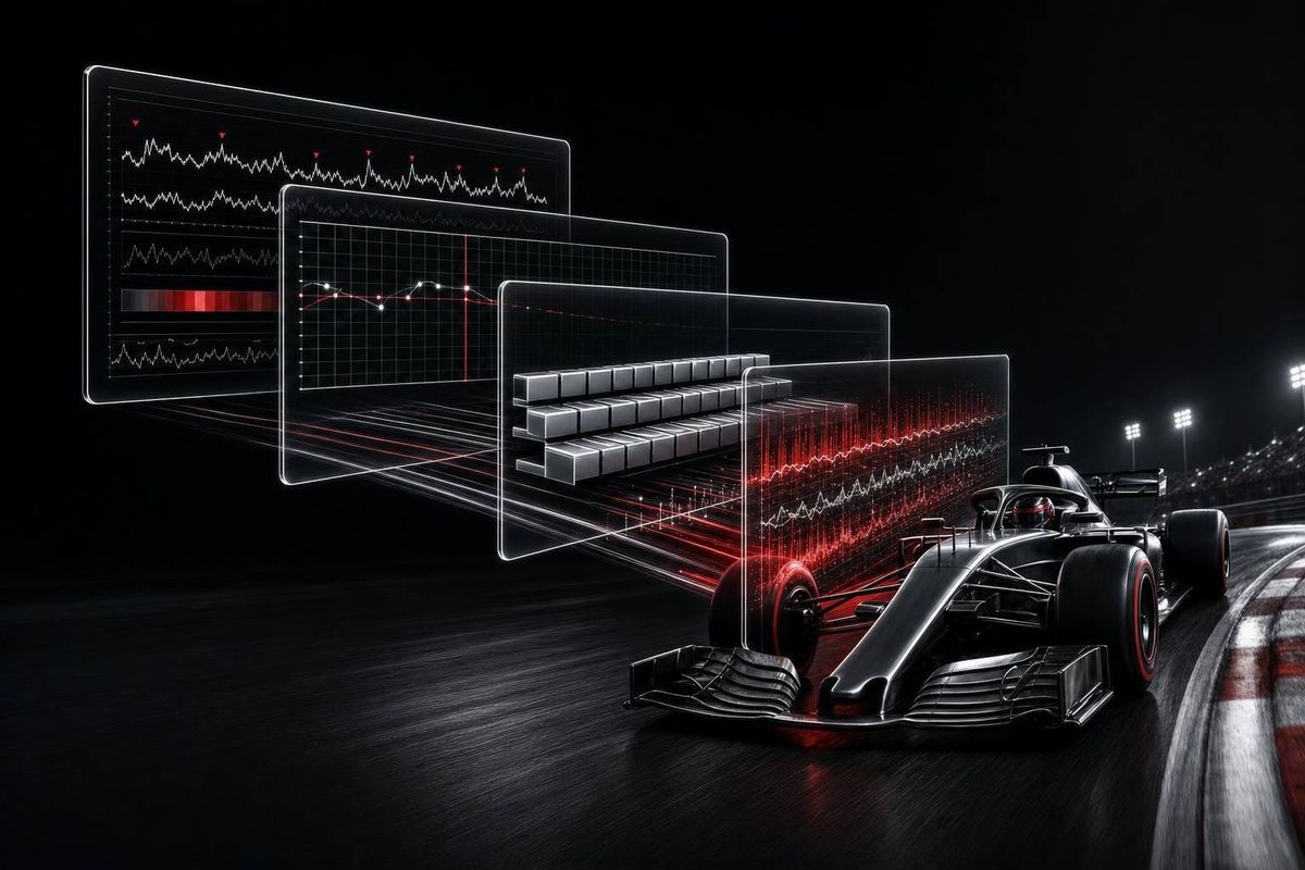
An F1 team can deal with about 1.1 million data points per second per car, and Azure Data Explorer helps turn that firehose into live race views and later engineering analysis.
If I had to sum up this guide in a few lines, it’s this:
- Use streaming ingestion when the pit wall needs data in seconds or less
- Use queued ingestion for bulk session logs and backfill
- Use KQL time-series tools for lap, stint, and trend analysis
- Use KQL window functions to spot sudden changes like brake spikes or DRS events
- Use live dashboards for race-day views, then shift older data to lower-cost storage for long-term review
In plain terms: ADX gives teams one place to ingest, query, and view telemetry from 300+ sensors per car across speed, RPM, tire temps, fuel, and power unit signals. That matters when a race weekend can produce around 160 TB across the grid, and when even small delays can distort gap and stint analysis.
A few points stand out right away:
- Schema design matters: IDs like
session_id,driver_number,lap_number, and high-precisiontimestampfields keep queries clean - Live queries should stay narrow and focused on the signals engineers need right now
- Deeper cleanup, outlier checks, and long-run comparisons fit better after the session
- Grafana, ADX Dashboards, and Power BI each fit a different part of the workflow
Quick comparison
| Area | Best fit in ADX setup | Main use in F1 |
|---|---|---|
| Ingestion | Streaming | Live pit wall and virtual pit wall |
| Ingestion | Queued | Session archive and history loads |
| Query style | Time-series functions | Lap overlays, smoothing, degradation trends |
| Query style | Window functions | State changes and rolling pace checks |
| Visualization | Grafana / ADX Dashboards / Power BI | Live race views, drill-down work, and post-session reports |
So if you want the short answer, here it is: ADX works best when live telemetry, fast queries, and race-day dashboards need to run together without splitting the workflow across several systems.
Formula 1 telemetry analytics with ADX
sbb-itb-7c68254
F1 telemetry workloads and how ADX fits them
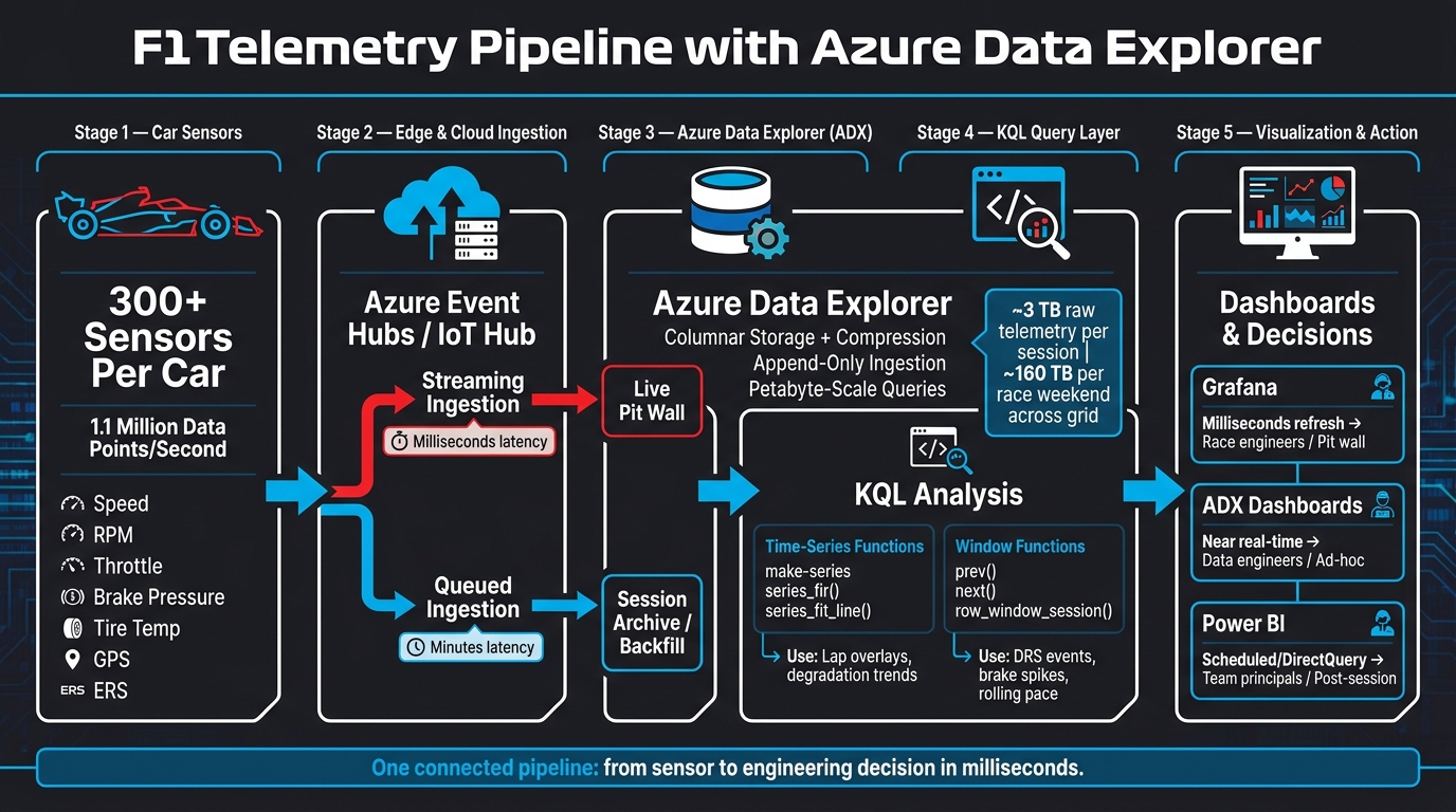
F1 Telemetry Pipeline: From Car Sensors to Pit Wall Decisions with Azure Data Explorer
F1 telemetry moves from car sensors to trackside edge systems, then through Azure Event Hubs or IoT Hub into ADX for live monitoring and post-session review. At that point, ingestion design becomes the next pressure point.
How F1 telemetry differs from ordinary sports data
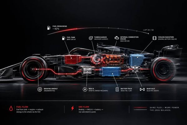
F1 telemetry isn't like a typical sports feed. It's a high-frequency stream made up of many signals at once. A single car carries more than 300 sensors and can produce about 1.1 million telemetry data points per second. That stream includes speed, RPM, throttle position, brake pressure, tire and brake temperatures, G-force, GPS coordinates, fuel consumption, and power unit data, including ERS status.
Each signal matters for a different reason. Throttle and brake traces can show how steady a driver is through braking zones. Tire temperature trends can hint at degradation before lap times start to slip. Power unit data can show whether the engine or ERS is staying within operating limits. In practice, engineers watch dozens of signals at the same time and try to spot how they affect each other across laps and stints.
Why ADX handles high-ingestion, low-latency racing data well
ADX works well here because its managed columnar storage compresses large session datasets and lets queries scan only the channels that matter. That matters a lot when one racing session can produce around 3 TB of raw telemetry.
Telemetry is also append-only. The car keeps writing new data points forward in time instead of changing old ones. ADX fits that pattern well, and KQL is a good match for time-series and log analysis. So teams can run rolling averages, spot anomalies across laps, and compare stint performance while the session is still happening.
| ADX Property | Why It Matters for F1 |
|---|---|
| Columnar storage + compression | Cuts storage use for multi-TB session data and supports both live queries and post-session review |
| Append-only ingestion model | Matches the continuous, forward-only flow of telemetry from car to pit wall |
| KQL time-series operators | Supports lap-by-lap and stint-level analysis without awkward SQL workarounds |
| Petabyte-scale ad hoc queries | Lets teams use one system for live session monitoring and deep historical debriefs |
| Millisecond refresh support | Keeps pit wall dashboards current during fast-moving race situations |
The next step is figuring out how to get that stream into ADX without adding lag.
Ingesting F1 telemetry into Azure Data Explorer
ADX ingestion usually follows two routes: streaming for live timing, and queued ingestion for bulk session storage. The next move is simple: match each telemetry workload to the right path.
A good F1 schema ties every record back to IDs like session_id, driver_number, lap_number, and timestamp. Partition by driver_number and sort by timestamp to help compression and query performance. Use millisecond- or microsecond-level timestamps. If the clock is too coarse, gap-to-leader analysis gets warped.
It also pays to define ingestion mappings early. When sensor payloads come in as JSON from Azure Event Hubs or Azure IoT Hub, ADX needs clear mappings so each field lands in the right column with the right type. For example, a raw v_spd field might map to a Speed column, while engine RPM should map to an integer RPM column. If those mappings aren’t set up first, high-rate telemetry can land with the wrong type, and that creates a mess later.
Streaming ingestion for live pit wall and virtual pit wall views
Streaming ingestion fits live race operations, where engineers need to see the current lap as it unfolds. It makes data available in ADX within seconds or even milliseconds after arrival. Telemetry sent through an edge node into ADX can hit millisecond refresh rates for tire wear, engine temperature, and RPM monitoring.
Use a streaming ingestion policy for live pit-wall and virtual pit-wall views. The big win is lower latency. The tradeoff is cost, since compute per record is higher, so cluster sizing needs to match session demand.
When the session ends, that same telemetry usually moves from live monitoring into bulk archive mode.
Queued ingestion for bulk logging and historical backfill
After a session, the goal shifts from low latency to efficiency. Queued ingestion batches records before writing them to ADX, which improves throughput and cuts compute overhead. It’s a good fit for session archives in Azure Blob Storage and for historical backfill.
A common setup is to keep current-race-weekend data hot and move older sessions to cold storage. That trims cost without getting in the way of review work.
Streaming vs. queued ingestion for F1 telemetry: a comparison
| Feature | Streaming Ingestion | Queued Ingestion |
|---|---|---|
| Latency | Milliseconds to seconds | Minutes (due to batching) |
| Throughput efficiency | Lower; optimized for immediate visibility | Higher; optimized for bulk data volume |
| Ideal F1 use case | Live pit wall, virtual pit wall, real-time alerts | Post-session engineering, historical backfill, season-over-season analysis |
| Operational complexity | Higher; requires a streaming policy | Lower; uses bulk uploads from Blob storage |
| Cost impact | Higher compute per GB | Lower compute per GB |
Once telemetry lands in ADX, KQL can turn it into lap, stint, and event views.
Querying telemetry with KQL: time-series analysis and window functions
With telemetry in ADX, KQL turns raw sensor streams into lap, stint, and event views that the pit wall and engineering team can act on. Each F1 car generates 1.1 million telemetry data points per second, so every query needs a clear job. In practice, engineers lean on two main sets of tools: time-series functions and window functions. Knowing which one to use, and when, is the difference between a useful readout and a slow, noisy mess. That’s why query design matters just as much as ingestion design.
Building time series by car, lap, and stint
Use make-series to turn uneven telemetry into fixed time buckets, like 100 ms intervals, grouped by driver_number and lap_number. That makes it much easier to compare driver pace, tire falloff, and power-unit behavior using the same lap shape instead of trying to line up messy raw points by hand.
From there, series_fir() helps smooth short bursts of noise, while series_fit_line() gives you a clean way to measure degradation slope. So if tire temperature starts drifting down over a stint, the trend is easier to spot and easier to project.
Before comparing race pace, clean the trace first. Strip out in-laps, out-laps, Safety Car laps, and non-representative throttle traces. If you skip that step, the comparison can go sideways fast.
Once the trace is clean, window functions help pull out the events hiding inside it.
Using window functions to detect race events and rolling performance changes
After you’ve built the baseline, window functions help flag the moments that matter. They’re useful for spotting the exact point where behavior changes, like braking spikes, DRS toggles, or Safety Car deltas.
prev() and next() compare each row with the row right before or after it. That makes them a good fit for discrete state changes, such as a sharp speed drop in a braking zone. row_window_session() supports rolling aggregations, like a moving average of sector pace, which can smooth out the effect of traffic without masking a real pace drop.
On the pit wall, keep live filters tight and focused on signals like RPM, engine temperature, and tire wear. Save heavier cleanup, stint comparisons, and anomaly checks with series_outliers() for post-session work.
Time-series functions vs. window functions in KQL: a comparison
The split is pretty simple: keep live queries narrow, and move deeper analysis offline.
| Function Type | Example KQL Function | Primary F1 Use Case | Scope |
|---|---|---|---|
| Time-series | make-series |
Uniform telemetry traces for lap-over-lap overlays | Per car / lap |
| Time-series | series_fir() |
Smoothing noisy tire temperature or RPM signals | Per stint |
| Time-series | series_fit_line() |
Measuring tire degradation slope | Per stint |
| Time-series | series_stats() |
Comparing peak speed or max temperature | Full session |
| Window (row) | prev() / next() |
Detecting state changes such as DRS on/off or brake spikes | Per lap |
| Window (agg) | row_window_session() |
Rolling sector pace or fuel-use trends | Per stint |
Dashboards, trackside workflows, and post-session review
Live dashboards for current laps, gaps, and car condition
Once KQL turns raw telemetry into lap and stint views, dashboards make that data useful on the pit wall. ADX's native dashboards support near real-time refresh and give data engineers direct KQL access. In a live session, teams often use tiles for speed, gaps, tire degradation, engine temperature, and RPM, all fed from the same ADX cluster.
For the dashboard to stay fast, place the visualization layer in the same Azure region as the ADX cluster. That setup cuts delay and helps teams act on KQL output while the session is still unfolding, not after the moment has passed.
The same low-latency setup also powers the virtual pit wall. Engineers back at the factory can see the same telemetry as the trackside crew and help with strategy calls and technical troubleshooting.
Where ADX fits best: trackside vs. post-session engineering analysis
Live dashboards are built for the fastest-moving telemetry. That's where ADX fits best. When engineers need an answer right now - gap-to-leader checks, tire degradation alerts, or an RPM spike in the middle of a stint - ADX is a strong fit.
After the checkered flag, the job changes. Engineers start comparing the current session with past runs and working through more complex simulations. For that, teams often move older data into broader historical stores like Azure Blob Storage so they can run cross-season comparisons. A simple way to think about it: use ADX for live and near-live telemetry, then shift long-range comparisons and simulations to archival storage.
ADX Dashboards vs. Grafana vs. Power BI for telemetry views
Each tool has its own job.
Grafana, using its first-class ADX plugin, supports millisecond refresh rates and includes gauge components like speed gauges, bar gauges, and RPM dials that match how race engineers read car data. If Grafana Cloud runs in the same Azure region as the ADX cluster, latency stays low enough for pit wall use.
ADX's native dashboards work better for ad-hoc KQL work and for keeping an eye on ingestion health. Power BI is a better match for post-session reporting, trend summaries, and executive-facing views for team principals, sponsors, and strategy leads.
| Feature | ADX Dashboards | Grafana | Power BI |
|---|---|---|---|
| Refresh Style | Near real-time / interactive | Millisecond refresh | Scheduled or DirectQuery |
| Best Use Case | Ad-hoc exploration & ingestion health | Live race telemetry & engineering views | Post-session reporting & executive summaries |
| Telemetry Detail | High (raw KQL access) | High (visual gauges and traces) | Aggregated / trend-focused |
| Audience | Data engineers / analysts | Race engineers / pit wall | Team principals / sponsors / strategy |
| Strengths | Native ADX integration | Advanced observability, millisecond latency | Rich storytelling, historical comparisons |
Use Grafana for live race operations, ADX Dashboards for drill-down work, and Power BI for post-session reporting.
Conclusion: A practical ADX blueprint for F1 telemetry processing
From ingestion to queries to dashboards, ADX gives F1 teams one connected telemetry pipeline. The setup comes down to three linked parts: high-volume ingestion, fast time-series queries, and a visualization layer that can keep pace with live race operations.
On the ingestion side, the pipeline splits into two paths. Streaming ingestion handles live pit wall metrics. Queued ingestion fits bulk logging, historical backfill, and post-session engineering review. Put simply, you use the fast lane when every second counts, and the bulk lane when scale matters more. That keeps latency low where it matters and throughput high where it doesn’t.
Once telemetry is in ADX, KQL keeps that same pipeline useful during the session. Time-series functions help teams build clean lap and stint views. Window functions help spot performance changes as they show up. That’s how raw telemetry becomes lap-level decision-making.
The practical value of ADX is simple: it cuts the time between a sensor reading and an engineering call. Each layer is there for a reason. It moves telemetry fast enough for race-day decisions and gives engineers enough depth for post-session analysis. In F1, that means one system for live calls, session review, and historical analysis.
FAQs
When should teams use streaming rather than queued ingestion?
Use streaming ingestion when telemetry has to support near-real-time decisions, like pit-wall monitoring and live dashboards. The big reason is simple: low latency keeps dashboards and alerts up to date during the race.
Use queued or asynchronous ingestion for heavier computation that can handle some delay. That fits deeper post-session analysis, simulations, and historical comparisons, where completeness matters more than instant visibility.
How should F1 telemetry data be structured in Azure Data Explorer?
Structure F1 telemetry in ADX as time-series events: one row per timestamp, per car or driver, per channel or metric. That layout makes filtering much simpler, and it gives you a clean path for windowed calculations by stint, lap, or sector.
Include context fields like session, round, event name, driver or car ID, lap number, and stint. Store each reading as a sensor or metric name plus a numeric value. Also, keep each driver’s event stream ordered by timestamp so time-based analysis works the way you expect.
Which KQL functions work best for laps, stints, and sudden events?
For laps and stints, the best fit is usually time/sequence grouping, aggregation, and window/series math. Those methods help you split continuous driving into clean segments, sum up what happened in each one, and track rolling trends over time.
For sudden events, use windowed lookbacks with conditional logic to flag threshold crossings or sharp jumps against a recent baseline. Then materialize those detections so they’re ready for live dashboards and post-session review.