Williams Rebrands: A Look at Logo Changes
How a team balanced sponsor demands and heritage across decades, using logo changes to trade commercial gain for lasting identity.
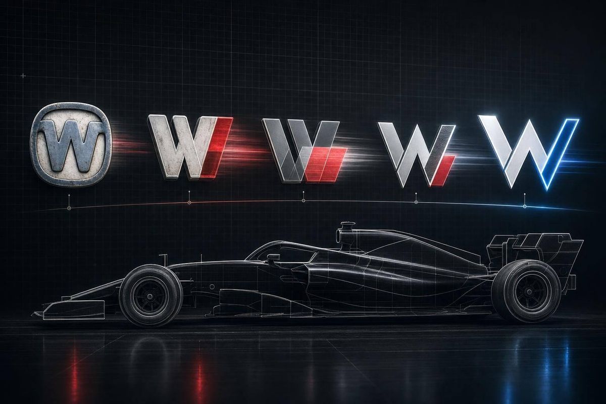
Williams changed its logo and visual style for one main reason: money and control. From 1977 to 2026, the team moved back and forth between two paths: sponsor-first branding and Williams-first branding.
If you want the short version, here it is:
- 1977–1983: the original Forward W gave Williams a simple team identity.
- 1984–1993: Canon/Camel branding added sponsor color without wiping out Williams blue.
- 1994–1999: Rothmans fit the team better than Winfield, which pushed Williams’ own look further back.
- 2000–2005: BMW turned Williams into a co-branded team, not just a sponsored one.
- 2006–2013: Williams moved back to a team-owned monogram after BMW left.
- 2014–2020: Martini blended sponsor style with Williams’ base colors better than most title deals.
- 2020–2025: the Williams Racing wordmark gave the team a cleaner identity after Dorilton bought it.
- 2025–2026: the Atlassian Williams F1 Team brought back the Forward W, mixing old Williams cues with a new title partner.
A few numbers explain why this kept happening:
- Williams has won 9 Constructors’ Championships
- Corporate partnerships made up about 85% of the team’s $128 million revenue in 2024
- Williams posted a $24 million loss in 2019
- The FW14B won 62.5% of its races in 1992
The main pattern is simple: when sponsors had more control, the look changed more. When Williams wanted stability, it went back to its own name, colors, and symbols. That tradeoff sits at the center of every logo era.
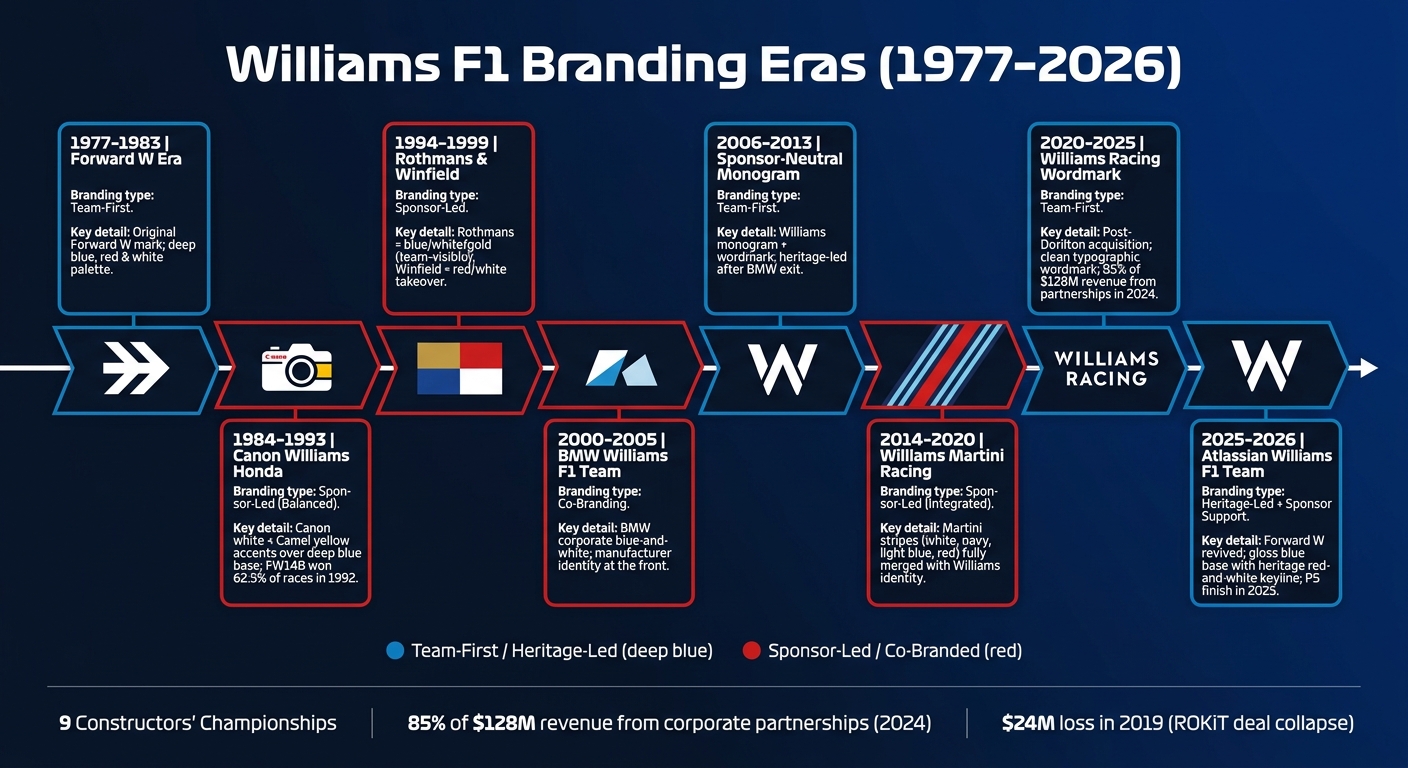
Williams F1 Branding Eras: From Forward W to Atlassian (1977–2026)
Quick comparison
| Era | Main branding approach | What changed most | Main takeaway |
|---|---|---|---|
| 1977–1983 | Team-first | Forward W | Clear Williams base |
| 1984–1993 | Sponsor-led, but balanced | Canon/Camel colors | Sponsors added in without losing team look |
| 1994–1999 | Sponsor-led | Rothmans, then Winfield | Rothmans fit better; Winfield took over more |
| 2000–2005 | Co-branding | BMW name and colors | Car maker identity moved to the front |
| 2006–2013 | Team-first | Monogram and wordmark | More control, less sponsor pull |
| 2014–2020 | Sponsor-led | Martini stripes and naming | One of the cleaner sponsor-team mixes |
| 2020–2025 | Team-first | Williams Racing wordmark | Built for partner turnover and digital use |
| 2025–2026 | Heritage-led with sponsor support | Return of Forward W | Old symbol reused for a new partner era |
If you’re reading this to understand which Williams rebrands worked best, the answer is pretty direct: the strongest ones kept Williams easy to spot even when a title sponsor had major space on the car.
sbb-itb-7c68254
1. Forward W Era (1977–1983)
The original Forward W shaped Williams from 1977 to 1983 and set the visual baseline the team would keep coming back to. Because that mark was so clear and consistent, every sponsor-driven shift that came later stood out more.
Design simplicity
The Forward W was clean and easy to spot at a glance. It worked well on the car, team uniforms, and pit equipment, which gave Williams a steady look across everything fans saw. The team’s deep blue, red, and white color scheme also became a lasting visual signal.
Brand distinctiveness
Formula 1 has long been packed with sponsor logos, and that made Williams’ restraint stand out even more. Other teams were more and more tied to sponsor-led looks, but Williams used the Forward W as the brand itself. That gave the team its own clear identity on track and in the paddock.
Heritage continuity
Later periods brought in sponsor identities, but Williams kept circling back to the Forward W and the cues tied to it. The next Williams logo would still be recognizable, just not as untouched.
2. Canon Williams Honda Identity (1984–1993)
Williams handled this era with a steady hand. The team kept its deep blue base, then layered in sponsor colors without letting the car lose its own look.
Sponsor integration
The core stayed deep blue, with Canon white and Camel yellow used as accents. That mix gave Williams a car you could pick out right away, even from a distance.
That mattered on track too. The FW14B turned this livery into part of Williams’ winning image in 1992. It won 62.5% of the Grands Prix it entered, which tied this look to one of the team’s most dominant seasons.
Heritage continuity
Deep blue remained at the center of the design, and the 1992 livery still stands as a key reference point for Williams’ modern Heritage work. In 2023, Williams revisited that same palette with a Heritage livery option for fans.
Brand distinctiveness
That long run of visual consistency made Williams instantly easy to spot across the 1984–93 period. Just as important, it showed how a team could give sponsors clear space without giving up its own identity. That balance became the model for many of Williams’ later branding choices.
3. Rothmans and Winfield Era (1994–1999)
This stretch put Williams in a tricky spot. The team had to keep its own look intact while giving two very different sponsors plenty of room on the car.
Sponsor integration
From 1994 to 1997, Rothmans brought in a blue, white, and gold palette. It sat next to Williams' existing identity instead of wiping it out. The car still looked like a Williams first, with Rothmans worked into the design.
From 1998 to 1999, Winfield took things in another direction. The car switched to a red-and-white palette, which created a much sharper break from Williams' usual colors. Rothmans kept Williams visible; Winfield made the sponsor the first thing you noticed.
Heritage continuity
Rothmans kept the blue base in place. Winfield dropped it. That change made the contrast hard to miss.
The Winfield years showed just how far the team could shift when sponsor branding came first.
Brand distinctiveness
Rothmans kept the car recognizably Williams. Winfield was more forceful, with red and white driving the whole visual impression and pushing the team's own identity into the background.
That push and pull between sponsor control and team identity carried straight into the BMW-era branding that followed.
4. BMW Williams F1 Team Branding (2000–2005)
During the BMW Williams F1 Team years, BMW moved to the front of the brand. Williams no longer looked like a team simply carrying sponsor logos. It looked tied to a car maker in a much deeper way. The shift changed more than the team name. It changed how the car looked and how the whole outfit presented itself. This was the point where sponsor decoration gave way to full co-branding.
Sponsor integration
BMW had a strong hand in both the team name and the car’s visual style. The team used a blue-and-white palette that matched BMW’s corporate colors, which gave the car a cleaner, more corporate feel. In plain terms, BMW’s blue-and-white identity shaped the whole image of the team, not just a few parts of the livery.
Heritage continuity
Williams still held onto its deep blue as the main link to its past. That kept a clear visual thread running through a period led by BMW’s name.
Brand distinctiveness
The end result felt precise and corporate, but it was still clearly Williams. That tension mattered. Even with BMW taking center stage, the team didn’t lose itself, and that balance lasted until Williams shifted again toward a more sponsor-neutral identity.
5. Sponsor-Neutral Williams Monogram (2006–2013)
After BMW left in 2005, Williams moved to a sponsor-neutral look built around its monogram and team name. Deep blue stayed at the center, and the team leaned on its championship past to stand apart. The mark looked cleaner. But it was also tougher to turn into sponsor revenue.
Heritage continuity
This heritage-first direction gave Williams room to put its own story front and center instead of borrowing a sponsor’s visual style. In plain terms, the monogram acted like a bridge to what Williams already stood for in Formula 1.
Design simplicity
The monogram and wordmark pulled the look back to the basics. The branding felt cleaner and more deliberate, with the team name getting top billing. That gave Williams a livery that looked unmistakably like Williams.
Brand distinctiveness
That sharper identity made the brand easier to recognize, but it also meant less room for sponsors to stand out. And that made ad space harder to sell. Williams got more clarity, but gave up some commercial freedom. Before long, that trade-off shifted as sponsor-led branding came back.
6. Williams Martini Racing Identity (2014–2020)
After the sponsor-neutral monogram period, Martini brought back a fully integrated commercial identity. Williams shifted to a sponsor-led look, built around white, navy, light blue, and red stripes pulled from Martini Racing’s motorsport heritage. The car’s design no longer treated the sponsor as something placed on top. Instead, the Williams Martini Racing name made the partnership part of the brand itself.
Sponsor integration
Martini’s stripe pattern and Williams’ identity came together so tightly that the sponsor’s visual language became the car’s visual language. It felt less like sponsorship placement and more like one shared system.
Heritage continuity
The deep blue base kept the car connected to Williams’ past. That mattered. Without it, the livery could have felt like a full handover. Instead, it read as an evolution, not a break, and made the Martini era feel like an update rather than a reset.
Brand distinctiveness
The Martini stripes gave Williams a clean, easy-to-spot look after the quieter monogram years. It was simple, sharp, and hard to miss at speed. The Martini era also showed something pretty clear: sponsor-led branding worked best when Williams’ core colors still had a visible place in the design. That balance helped point the team toward its next step - a cleaner, more team-first identity.
7. Williams Racing Wordmark Era (2020–2025)
After the Martini deal ended, Williams needed a mark that could outlast sponsor changes. When Dorilton Capital acquired Williams in September 2020, the team needed a steady identity tied to the team itself, not a title sponsor. Williams responded with a clean "Williams Racing" wordmark: sharp, typographic, and built to hold up across shifting partner lineups.
Design simplicity
The new wordmark stripped out the layered sponsor graphics from earlier eras. It was shaped to feel engineered, fast, and team-first instead of sponsor-led. That change was intentional. Williams wasn't simplifying just for the sake of it. The point was to make the team's core identity clearer while still looking unmistakably like Williams.
Sponsor integration
A simpler main identity also made special liveries easier to slot in. You can see that in the 2023 Gulf "Bolder than Bold" design, which pulled in 180,000 votes across three knockout rounds.
Heritage continuity
At the same time, the team kept leaning on its history, including its nine Constructors' Championships. That gave the wordmark era a direct link to Williams' racing past instead of making it feel like a total reset.
Brand distinctiveness
The downside was pretty clear: without the Martini stripes, the car had less instant visual punch. But the wordmark era built something that lasted longer - a brand system Williams owned outright. By 2024, corporate partnerships made up about 85% of Williams' $128 million revenue, a strong sign that the cleaner identity worked on the business side too. That team-owned base also set up the 2025 return to a more symbolic Williams mark.
8. Atlassian Williams F1 Team Forward W Rebrand (2025–2026)
Sponsor integration
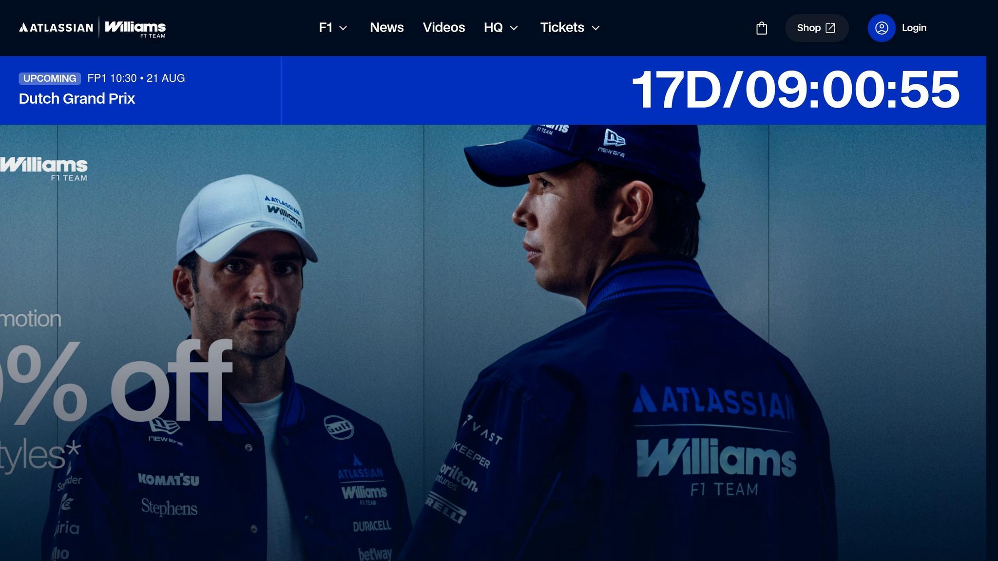
In February 2026, Williams revealed the FW48 livery and officially renamed the team the Atlassian Williams F1 Team, with several major partners announced before the launch. The Forward W came back as the main mark, cleaned up for the Atlassian era. That change matters because it brings back a symbol fans already connect with Williams, instead of leaning only on a fresh team name.
Heritage continuity
The FW48 also brought back a bright gloss blue base, with a heritage red and white keyline. Blue stayed front and center, while the red-and-white detail linked the car to Williams' past. Unlike some earlier sponsor-heavy periods, the partners here fit into the team identity rather than taking it over.
Brand distinctiveness
The design stripped the mark back, removing extra parts while keeping the cues people know. Attlas Design said:
"The new wordmark feels bold, fast, and engineered - more like an F1 car and less like an apparel label. The typography is sharp, confident, and unmistakably connected to the sport."
Williams' P5 finish in 2025 gave the rebrand more force, and multi-year corporate partnerships made up about 85% of Williams' $128 million revenue in 2024. Carlos Sainz called the launch "A real statement of intent". You can see the same push and pull here that has shaped every Williams rebrand: keep the team's past in view, but make enough room for sponsor presence.
Why Williams Kept Rebranding and What It Meant
Williams' branding history followed the money. Commercial partners didn't just appear on the car; they often shaped how the whole team looked. That's why the Canon, Rothmans, Winfield, BMW, and Martini eras felt so different at a glance. Each one leaned hard into sponsor colors and visual cues instead of building around one steady Williams-first look.
The 2006 monogram came after BMW left. The 2020 Williams Racing wordmark arrived after Dorilton took over. In both cases, the goal was continuity, not decoration. That tension, reset vs. continuity, sits at the center of Williams' branding story.
Put simply, Williams kept making a trade: short-term sponsor visibility on one side, long-term brand recognition on the other.
The 2025–2026 Atlassian Williams F1 Team rebrand is the clearest version yet of a different approach. Instead of letting the title sponsor take over the identity, Williams folded Atlassian into a look tied to its own past. The revived Forward W and the FW48's heritage red-and-white keyline show that shift clearly. New sponsorship sits on top of a visual core people can still spot as Williams.
That's also the easiest way to read the team's past changes: sponsor-led branding versus heritage-led design. Across each era, Williams kept choosing between visual consistency and commercial pull. The best identities managed to hold both at once.
Sponsor-Led vs. Heritage-Led Branding: Pros and Cons
Over the years, Williams has bounced between two branding paths: sponsor-led and heritage-led.
At the core, it’s a trade. Williams has often swapped some brand control for commercial exposure, and that trade has been a big one. In 2024, corporate partnerships made up about 85% of Williams’ $128 million revenue.
That model can work well when the deals are steady. The problem shows up when a sponsor leaves fast. That’s exactly what happened in 2020, when ROKiT’s naming rights deal fell apart. Around the same time, Williams reported a $24 million loss in 2019, which made that kind of dependence even tougher to handle.
Heritage-led branding solves part of that problem. It gives the team a more stable look and a clearer sense of self. But there’s a trade-off here too: it can come across as a bit conservative. Williams also had to keep sponsor clutter in check so partner logos stayed visible instead of getting lost in the livery.
The contrast is easiest to see side by side:
| Feature | Sponsor-Led | Heritage-Led |
|---|---|---|
| Brand Consistency | Lower; shifts with title partners. | Higher; anchored in Williams' long-running visual cues. |
| Sponsor Visibility | Maximum; partners often gain title placement and prominent livery space. | Moderate; sponsors fit within a pre-existing team identity. |
| Fan Recognition | High in standout seasons, less stable across transitions. | Strong long-term equity; heritage helps maintain recognition during performance dips. |
| Digital Flexibility | Variable; depends on partner brand guidelines. | High; clean wordmarks and monograms are easier to scale across digital channels. |
| Long-Term Equity | Risks a rented identity perception. | Builds a stable, credible standalone brand. |
Conclusion
Williams’ strongest rebrands worked because they kept one clear symbol at the center while still bending to sponsor pressure. The Canon-era car is still the clearest case of branding and performance pulling in the same direction. That same balance now shows up again in the Atlassian era.
The 2025–26 Atlassian rebrand follows that same playbook, with a revived Forward W and a cleaner, heritage-led presentation. In this version, heritage acts as a business asset, not just decoration. Atlassian and other partners sit inside a visual identity Williams already owns instead of replacing it. That helps explain why Williams’ branding has swung between long periods of stability and full reset.
Some rebrands were reactive, while others were planned with more intent. Sponsor-led branding buys visibility. Heritage-led branding builds staying power. Williams’ best rebrands update the team without losing who it is.
FAQs
Why did Williams change its logo so often?
Williams updated its logo and visual identity as part of a bigger move toward a more modern, business-minded strategy. The aim was to balance the team’s heritage with a forward-looking image that would appeal to a global fan base and new partners.
With bold design ideas, and at times input from fans, Williams tried to stand out in Formula 1 and strengthen its commercial position.
Which Williams rebrand worked best?
It depends on the goal.
For brand identity, the 2025 wordmark update is often seen as the strongest move. It shifted Williams away from a lifestyle-style look and toward a sharper, more engineered Formula One identity.
For fan engagement, the Bolder than Bold Gulf livery stands out most. It won a fan vote with more than 180,000 ballots, which shows how well Williams used interactive design to connect with its audience.
What does the return of the Forward W mean?
The sources available here don’t mention a Williams Racing rebrand or design feature called the Forward W.
What they do cover are other livery updates, such as:
- the fan-voted Gulf design
- retro-inspired tribute liveries
So if you’re looking for evidence tied to the Forward W, it isn’t in these sources.