F1 Data Visualization for Live Race Decisions
The best live-race F1 screen cuts the distance between signal and decision by keeping the right data front and center.
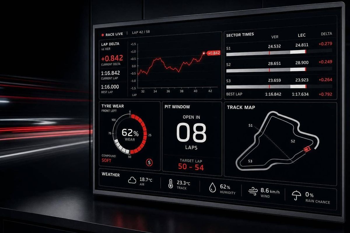
If I had to cut this down to one idea, it’s this: the best live-race screen is the one that gets the pit wall to an answer with the fewest steps.
In this comparison, I look at Undercut-F1, Formula-Timer, MultiViewer Race Trace, and Mine4Race through one lens: what helps a team act fast during a race. Across all four, the pattern is clear. Spatial gap views help with instant track context, gap and stint charts help with pit timing, telemetry panels help with pace reads, and weather or pit overlays matter most when conditions shift.
A few points stand out right away:
- Undercut-F1 puts gap reading on a track-style view and smooths movement for cleaner live reads.
- Formula-Timer leans harder into lap, stint, and tire charts for pace analysis.
- MultiViewer Race Trace keeps more data on one screen, which helps when you want timing, telemetry, and sector context together.
- Mine4Race splits live tracking and deeper review into Broadcast Mode and Analysis Mode.
- All four deal with the same core problem: too much detail can slow a call when every second counts.
The data load here is no joke. F1 telemetry can run at 300 Hz across 20 cars, with timing tracked to 0.001 seconds. At that scale, screen layout is not a side issue. It shapes how fast you can spot an undercut, react to weather, or judge whether to pit.
How to Read F1 Data and Telemetry | Formula 1 Analytics Tutorial
sbb-itb-7c68254
Quick Comparison
| Tool | Main screen focus | Best at | Main trade-off |
|---|---|---|---|
| Undercut-F1 | Spatial gap map + live position | Fast gap and pit-window reads | Less emphasis on deep chart work in the main live view |
| Formula-Timer | Pace, stint, and tire charts | Lap trend and degradation review | More chart reading under pressure |
| MultiViewer Race Trace | One-screen race dashboard | Seeing timing, telemetry, and sectors together | Less room for deep drill-down |
| Mine4Race | Split live and analysis modes | Clean live view plus post-look depth | Dense analysis view can slow fast decisions |
So if you’re asking, “Which layout helps a strategist move fastest?”, the short answer is simple: the one that keeps the key signal front and center, and pushes the rest into the background. The rest of the article breaks down how each tool handles that trade-off.
1. Undercut-F1
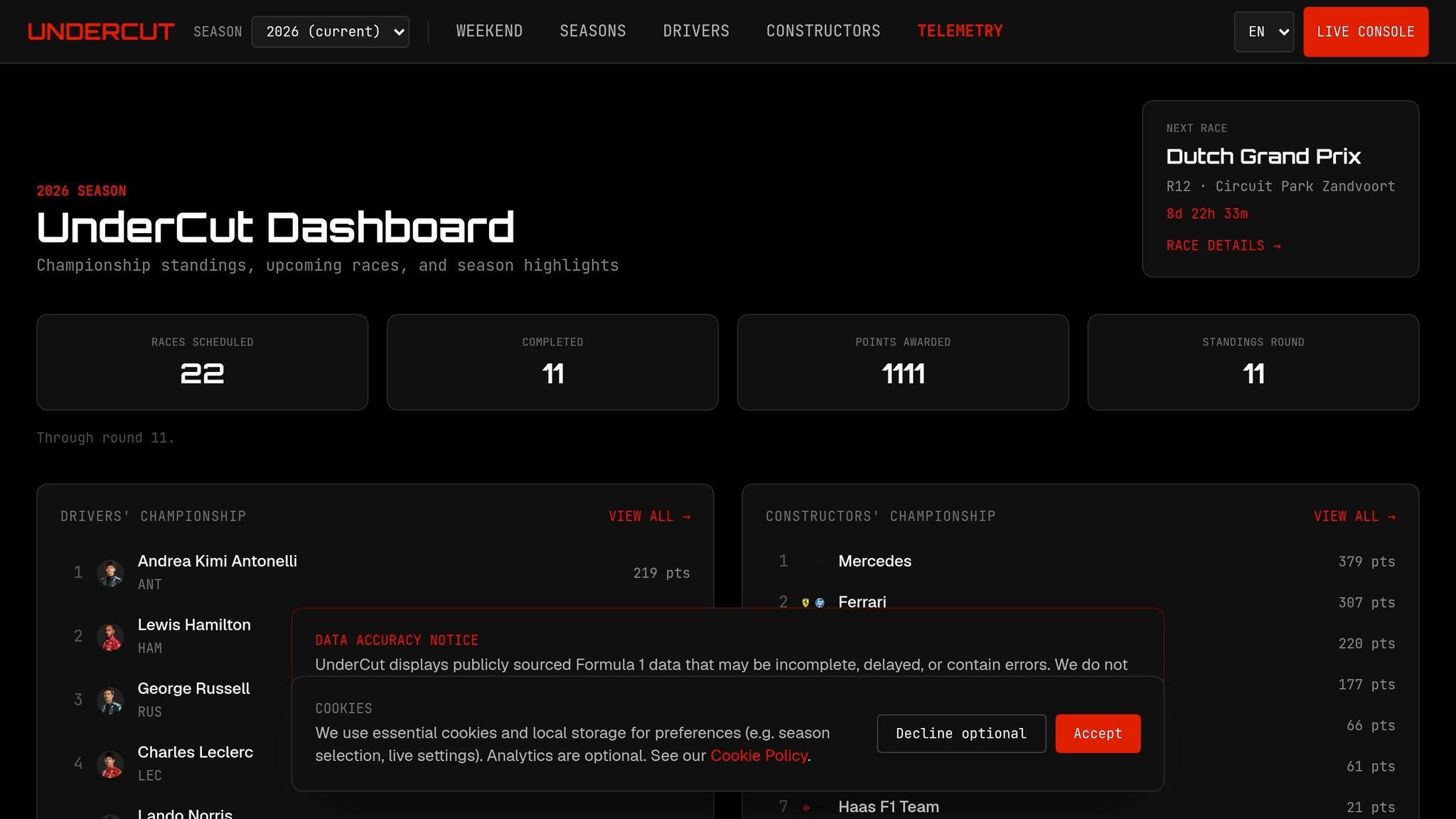
Undercut-F1 turns live timing into a spatial dashboard, so strategists can read gaps, pit windows, and track position at a glance. Instead of relying on tables, it uses a layout built for faster race reads. That choice matters most when engineers need gap data fast enough to cover or undercut a rival.
Timing-Gap Clarity
Rather than showing timing in a standard table, Undercut-F1 maps gap seconds against average lap time to place each car on the track. If the average lap is 90 seconds and the gap is 1.23 seconds, the trailing driver sits 1.37% of the track behind the leader. That turns raw gap data into an immediate track-position signal.
To keep motion readable, the system smooths updates with exponential smoothing at 0.03, spreading movement across roughly 30 frames. So instead of markers snapping around, gaps move in a steadier, easier-to-read way.
Telemetry and Layout
The platform pulls speed, throttle, and brake data from FastF1 and the OpenF1 API at 300 Hz. It also uses 12 customizable panels for telemetry, standings, and strategy. Pit stops shift the marker 35 pixels, which makes pitting cars stand out right away.
On top of that, an AI race engineer provides real-time tactical insights, while a voice commentary system delivers race updates. The setup is built to keep key information in front of the operator without burying them in extra clicks.
Strategy Integration
Analysis Mode combines a gap evolution chart with a strategy simulator to answer a simple race-day question: should a driver pit or stay out? That's the main idea here. Not more data for the sake of it, but faster calls when timing is tight.
The 1,000-point telemetry-rendered track map and audio updates help keep the race readable without slowing the operator down.
Undercut-F1 leans into spatial clarity; the next tools take the same race data and arrange it through different visual hierarchies.
2. Formula-Timer
Formula-Timer turns timing data into a visual dashboard built for fast race reads. If Undercut-F1 is built around spatial clarity, Formula-Timer puts more weight on charts for pace and stint analysis.
Timing-Gap Clarity
The platform converts time gaps into spatial distance on a 2D circuit map with visual_offset = gap_seconds / average_lap_time, which places each car relative to the field at a glance. It calculates those gaps from cumulative lap completion times, so if a driver lost time earlier in the race, that loss still shows up in the live view.
Telemetry and Tire Traces
That same visual style carries over into lap-comparison charts and tire wear tracking. Formula-Timer shows side-by-side line graphs for speed, gears, throttle, brakes, and RPM next to stint and session lap-time trends. It also includes a scatter plot with every driver's lap times, which makes outliers easier to spot.
These views help engineers sort raw pace from degradation, traffic, and track evolution.
There are limits, though. Telemetry gaps can still show up, and the platform does not include fuel-load or car-weight data, which can skew pace reads, especially when teams are running mixed plans. On desktop, hover interactions stay active and matter for reading exact chart values. On mobile, those hover features are turned off.
Strategy and Weather Integration
The layout also shifts from pace analysis to track conditions, pulling weather and track evolution into the pit-wall view. A track conditions panel covers weather, track activity, and session state, and it can filter the dashboard by time period to account for track evolution. When changing conditions affect tire calls and stint timing, this panel gives the pit wall a direct read on whether to react. It also includes a pit-or-stay-out simulator.
3. MultiViewer Race Trace
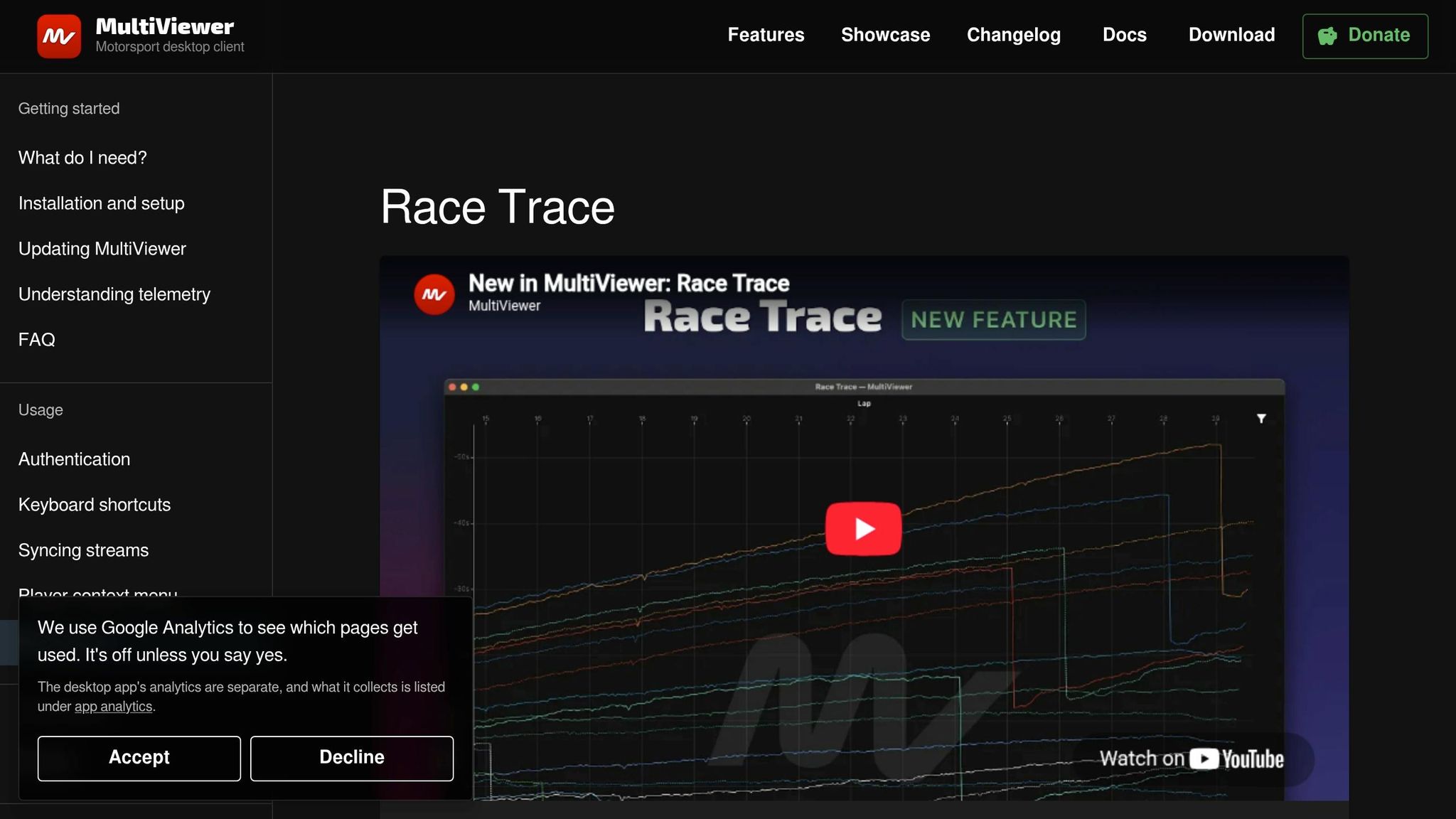
Where Formula-Timer splits analysis across separate views, MultiViewer packs much of the same race data onto one screen. MultiViewer Race Trace uses a fullscreen desktop dashboard that keeps timing, telemetry, and sector data in a single view.
Timing-Gap Clarity
The platform follows lap-time trends across the full session or a filtered stint, and it adds a scatter plot of all lap times for fast filtering. That one-screen setup makes it easier to go from spotting a trend to making a pit-wall call. Strategists can read the full field picture without bouncing between panels. As the most condensed layout covered so far, it gives up some drill-down depth in exchange for instant visibility.
Telemetry and Tire Traces
MultiViewer Race Trace includes a telemetry graph that compares two laps side by side, covering speed, gears, throttle, brakes, and RPM. It also includes a separate line graph that shows tire degradation through a stint, which helps with degradation reads and stint-length calls. A track map marks the fastest sector times.
That matters in practice. A strategist can move from lap trend to tire decision without changing panels, which cuts a few steps out of the workflow.
Alert Hierarchy and Screen Prioritization
The fullscreen layout keeps timing, telemetry, and sector data visible at the same time. Weather and track-condition data sit in the same screen hierarchy, so pace, gaps, and track context stay in view together instead of living in a separate panel. The layout leans toward seeing more at once rather than digging deeper into one area. Breadth comes first; depth comes second.
4. Mine4Race
Mine4Race, built inside the F1 Intelligence Studio project, uses a 2D SVG circuit map as the main live-race view. Instead of showing gaps as plain numbers, it turns them into position on the track. That shifts the focus away from raw data density and toward one thing: how fast the pit wall can read what’s happening.
Timing-Gap Clarity
Mine4Race converts gap seconds into track position with visual_offset = gap_seconds / average_lap_time, so a 1.234-second gap on a 90-second lap becomes about 1.37% of a lap, or roughly 14 points of visible separation. In plain terms, the system makes a time gap feel like a physical gap on the circuit.
A low smoothing factor keeps the markers from twitching during live updates. That matters in a race setting, because jumpy markers can make a small change look bigger than it is. Once that motion is under control, the next issue is simple: when the race gets messy, which signals stay on screen and which ones step back?
Telemetry and Tire Data
Mine4Race streams speed, throttle, brake, and tire compound data, then splits the interface into Broadcast Mode for live tracking and Analysis Mode for deeper gap and telemetry review.
That split makes sense. During the race, the team needs a clean read fast. After that, they can dig into the finer detail without cluttering the main view.
Strategy and Weather Integration
It pairs pit-window simulation with a dedicated weather and track-conditions panel for immediate race calls. That means strategy inputs and changing conditions sit close to the main race view, which is where they need to be when a call has to happen in seconds, not minutes.
Alert Hierarchy and Screen Prioritization
Broadcast Mode keeps the gap map and live order front and center, while weather, tire, and telemetry panels stay secondary. Weather overlays do not compete with the circuit map, which helps keep the live race view clean. Smoother marker motion also makes position changes easier to follow without extra visual noise.
What Visual Trade-Offs Mean for Live Race Calls
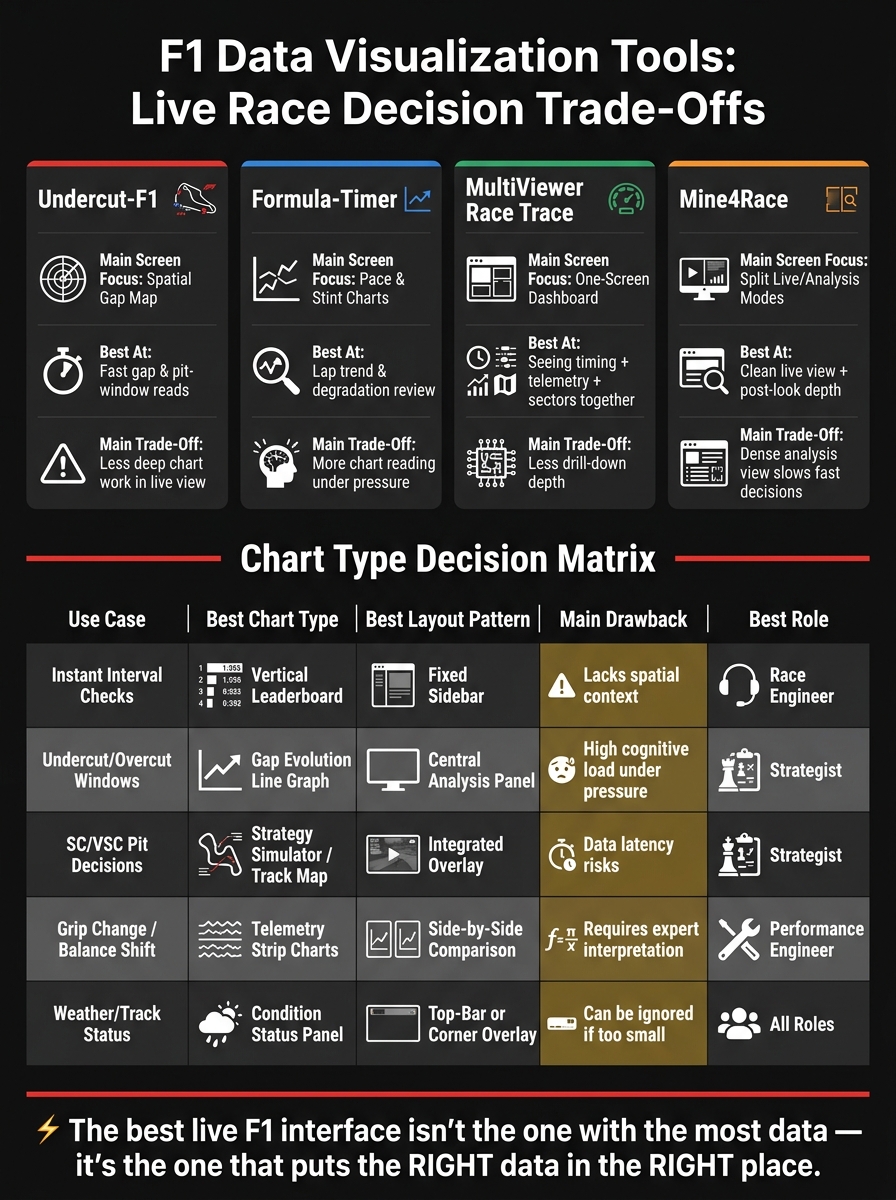
F1 Data Visualization Tools Compared: Speed vs. Depth for Live Race Decisions
The four tools above tackle the same race problem, but each one gives screen space to something different. And in a live race, that choice matters. Every layout is making the same trade-off: show more data, or put the one signal the pit wall needs front and center.
A leaderboard-first layout is the fastest way to check intervals. You can glance at it and get the number you need. The catch? It doesn't show where cars sit on track, so spatial context gets lost.
Gap evolution charts are great at showing undercut and overcut windows. They make race trends easier to spot over time. But there's a cost: they ask for more focus, which can be a problem when the room is under pressure and decisions need to happen fast.
Telemetry strip charts pack in the most detail. They're the densest option on the screen, and that can help when you're tracking grip change or balance shift. At the same time, they can swamp live decision-makers with too much information at once.
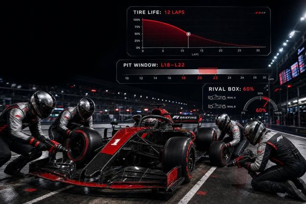
Weather and pit-window overlays become most useful when conditions shift in a hurry. Putting them right next to the main race view can cut reaction time, because the team doesn't have to bounce between separate parts of the screen.
| Criterion | Most Effective Chart Type | Strongest Layout Pattern | Main drawback during live calls | Best Use Case |
|---|---|---|---|---|
| Instant Interval Checks | Vertical Leaderboard | Fixed Sidebar | Lacks spatial context | Race Engineer |
| Undercut/Overcut Windows | Gap Evolution (Line Graph) | Central Analysis Panel | High cognitive load under pressure | Strategist |
| SC/VSC Pit Decisions | Strategy Simulator / Track Map | Integrated Overlay | Data latency risks | Strategist |
| Grip Change / Balance Shift | Telemetry Strip Charts | Side-by-Side Comparison | Requires expert interpretation | Performance Engineer |
| Weather/Track Status | Condition Status Panel | Top-Bar or Corner Overlay | Can be ignored if too small | All Roles |
That leads to the next step: some layouts help the team move faster, while others add friction when the race gets chaotic. Those layout choices shape the day-to-day pros and cons of each setup.
Pros and Cons
This comparison moves past feature checklists and gets to the part that matters in the moment: the practical cost of each screen choice. In plain terms, you're balancing speed, depth, or some mix of the two.
Mine4Race splits those jobs across Broadcast Mode and Analysis Mode. Broadcast Mode leans toward speed. Analysis Mode leans toward depth. That split makes sense, but there's a catch: when a screen gets dense, it can take longer to read when the pressure is on.
The table below isolates that live-race trade-off: what each mode helps you read fast, and what gets harder when decisions need to happen NOW.
| Mode | Key Strengths | Main Limitations | Best Use Cases |
|---|---|---|---|
| Broadcast Mode | Clean live tracking; spatial gap read at a glance | Less depth for detailed stint or telemetry analysis | Live race tracking, undercut timing |
| Analysis Mode | Deep gap charts, strategy tools, and telemetry comparison | Higher chart density can slow reads under pressure | Pit-or-stay-out calls, weather-triggered strategy changes |
The main point is simple: live race screens should favor speed over detail. Dense charts have their place, but that place is analysis, not first response. That's the trade-off behind each display style - and it leads straight into the final verdict on which one supports live calls best.
Conclusion
This comparison comes down to one thing: which screen gets priority when the pressure is on.
Each layout helps with a different race-day job. Leaderboard-first screens show who’s where right now. Gap charts make strategy shifts easier to spot. Telemetry and tire panels help engineers figure out what’s going on. Weather overlays can tighten up pit decisions.
But the part that matters most is simple: does the key information stay easy to read when things get hectic?
When every signal fights for space, the one that matters most gets buried. And once that happens, the call gets harder.
The best layout is the one that cuts the distance between the signal and the decision.
That’s the standard this comparison puts on the table. The clearest live F1 interface isn’t the one with the most data. It’s the one that puts the right data in the right place fast enough to change the call.
FAQs
Why do spatial gap maps help pit calls faster?
Spatial gap maps turn time gaps into a track-position view that engineers can read at a glance. By showing those gaps as a share of the lap, strategists can quickly see where a driver sits relative to traffic and the rivals that matter most.
On a 2D circuit map, teams can spot clean air windows and see whether a car is likely to rejoin in a fighting position or get stuck behind a slower DRS train. That helps them make pit calls faster when the decision window is tiny and the pressure is high.
When should live race screens favor charts over simpler views?
Live race screens should lean on charts when teams need fast, at-a-glance pattern spotting from dense data.
That matters most for tire temperature and degradation traces, timing and gap shifts, and weather overlays. In those moments, a wall of raw numbers can slow people down. Static views can do the same.
Line graphs, color-coded bars, and alert thresholds make telemetry easier to read under pressure. Engineers and strategists can scan the screen, spot changes, and react fast when split-second calls are on the line.
Which data should stay visible during weather or Safety Car changes?
During weather-related Safety Car periods, teams need a few data points front and center:
- Real-time sector times and gap analysis
- Live weather radar and storm projections
- Telemetry on tire wear and engine performance
- Current tire compounds, laps remaining, and crossover models
With that information in view, teams can make sharper calls on track position, pit-stop timing, and how fast conditions are shifting under pressure.