F1 Digital Content Leaves Some Fans Behind
F1's digital coverage often lacks captions, readable live timing, and fast mobile navigation; basic accessibility fixes would keep fans in the race.
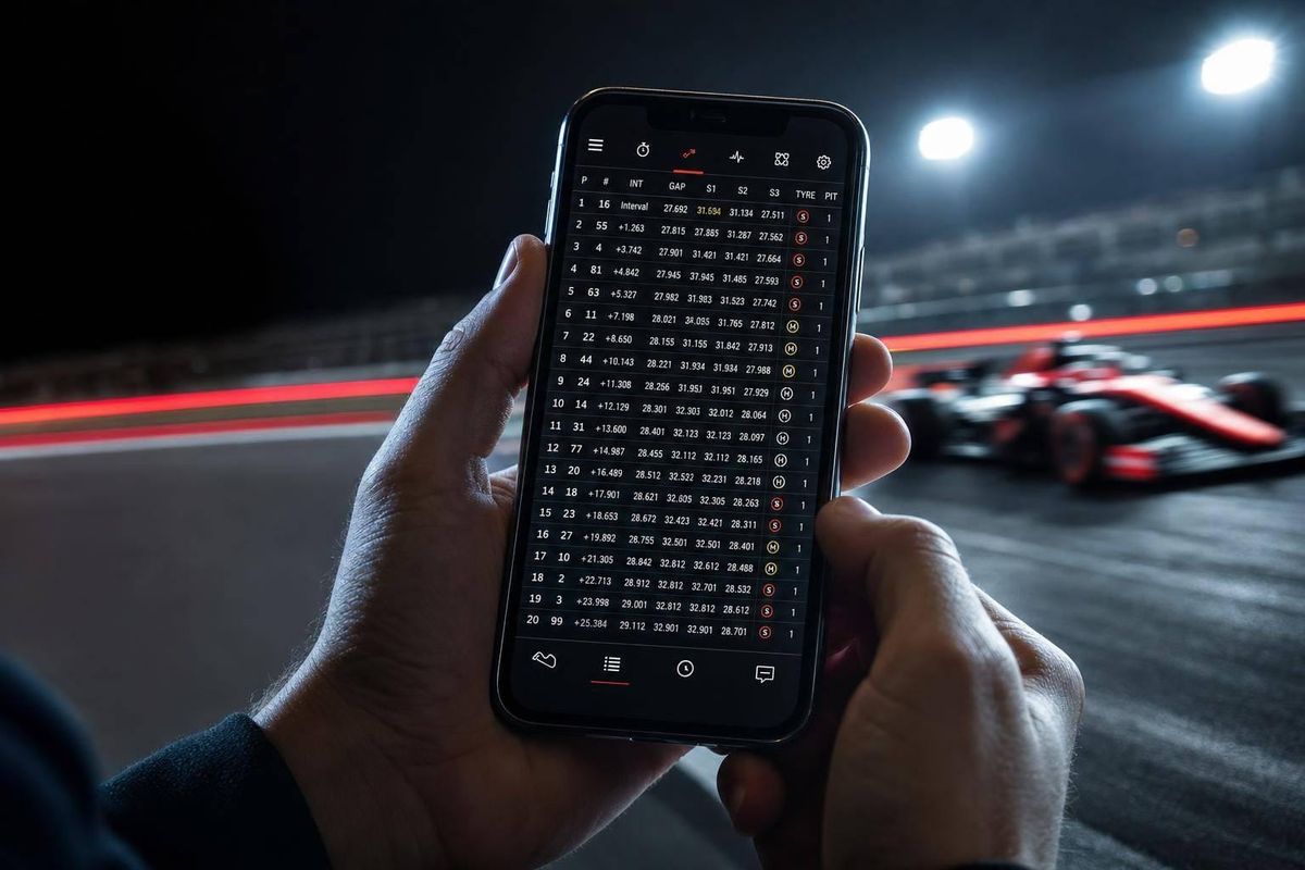
F1’s digital coverage is fast, but I think it still fails too many fans at the basic level. If captions are missing, timing data is hard to read, and app navigation takes too many taps, people miss race context in real time.
Here’s the short version:
- Missing captions block deaf and hard-of-hearing fans from team radio, clips, and press content.
- Low-contrast graphics, color-only signals, and small text make live timing harder to read on mobile.
- Deep menus, small buttons, and unlabeled icons slow fans down when they need live timing, onboards, and standings fast.
- The fix is not a full rebuild. I’d start with captions on all audio/video, readable timing data, and simpler navigation.
- The article also points to race examples from 2026, including issues seen at Silverstone, Spa-Francorchamps, and the Canadian Grand Prix.
If I boil it down even more, the article makes one point: F1 digital tools often assume perfect hearing, vision, dexterity, and prior knowledge. That leaves part of the audience behind during the moments that matter most.
The main fixes are clear:
- Immediate: captions on all video and team radio
- Short-term: high-contrast views, larger text, longer on-screen data, and bigger tap targets
- Next: accessibility checks before new features ship
I see this as a usability problem first. When fans need context in seconds, the product has to explain the race - not make people work to decode it.
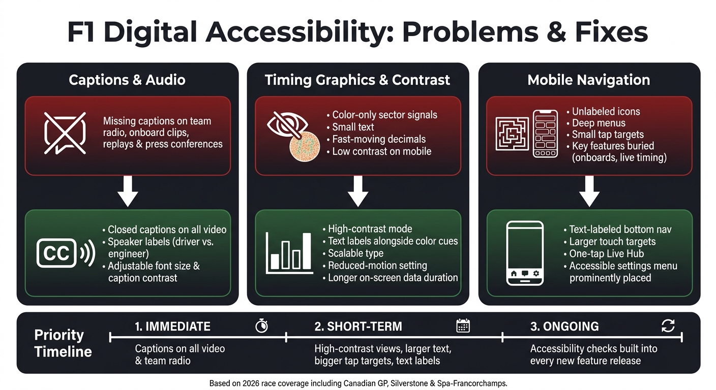
F1 Digital Accessibility: Current Issues vs. Recommended Fixes
Problem 1: Missing Captions Make Video and Team Radio Hard to Follow
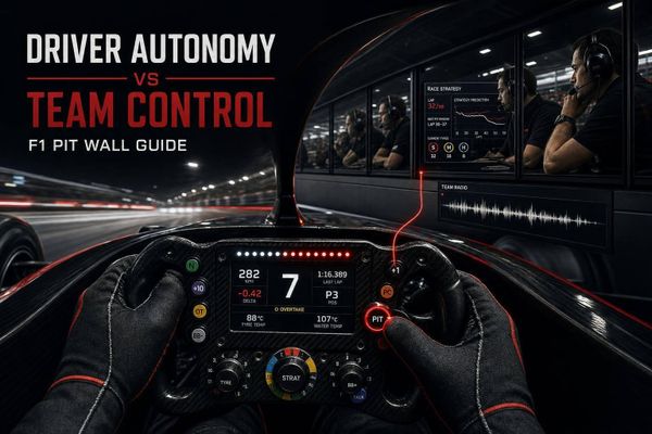
Team radio can explain a warning, a strategy call, or an incident in seconds. Without captions, that context just vanishes. The same issue affects clips, replay segments, and app-based video, not just live radio. So captions need to be there across clips, replays, and live radio.
Where Caption Gaps Show Up in F1 Content
Caption gaps show up most clearly in live team radio, onboard clips, and post-session analysis. During the 2026 Canadian Grand Prix, the live broadcast missed a brake-temperature warning sent to Oscar Piastri seconds before contact with Alex Albon. As Pablo Elizalde noted:
"the team radio around the moment, including a brake-temperature warning to Piastri seconds before contact, had never made the broadcast."
F1's Radio Rewind and Top 10 Onboard Moments sometimes bring back that missing context after the session. That helps later, but not when fans are trying to understand what just happened in the moment.
Fixes: Closed Captions and Better Audio Context
The clearest fix is simple: closed captions on every clip. That includes onboard clips, radio segments, and press conferences. On mobile, caption controls should be easy to spot, not hidden in a menu maze.
Speaker labels matter just as much as the words themselves. Fans need to know whether a line came from the driver, the engineer, or the team. Without that, a strategy exchange can turn into guesswork. F1 has already shown it can do this by translating non-English radio into English subtitles, including Fernando Alonso's Italian-language exchanges, so viewers can follow along. Applying that same level of care to caption accuracy and speaker labels across all content would make F1's digital coverage easier to follow.
Live press conferences and technical explainers also need live captions. It should also be simple for users to adjust font size, caption color, and background contrast.
The same accessibility gap shows up again when F1 shifts from audio to timing graphics.
sbb-itb-7c68254
Problem 2: Poor Contrast and Fast Graphics Make Timing Data Hard to Read
The moment a fan opens the live timing view, a new set of problems shows up - and this time, it’s not about sound.
Why Color-Only Signals and Small Text Fail on Mobile
F1’s timing graphics still rely a lot on color and tight layouts to show what’s happening on track. That may work on a big screen in ideal conditions. But on mobile, in bright sunlight, or for fans with low vision or color blindness, it gets much harder to read. On top of that, F1 timing graphics assume a lot of prior knowledge, which can make even helpful visuals feel hard to decode
As Sky Luk, a UI/UX designer, put it:
"Many fans miss out on key insights simply because the current apps are either too cluttered or fail to highlight the most relevant information."
F1 already has proof that this can be done better. The F1 Kids feed uses custom animated graphics and technical explainers to make the sport easier to follow, which suggests the issue is presentation, not a lack of information On mobile, the gap gets even bigger because small screens leave less space for labels, contrast, and motion settings.
Why Fast-Moving Data Overloads Some Fans
Even fans without vision-related needs can struggle with F1’s live timing. There’s just a lot happening at once. Real-time metrics pile up fast, and the most interesting battles can get lost inside crowded screens
"Anyone who's watched F1 knows the feeling of glancing at the leaderboard every few seconds to see if a comically precise number (e.g. +1.489) seems to be growing or shrinking over time. It's fun, but there are much better ways to present this information." - Nathan Baschez, Product Designer
That same friction shows up when fans try to get to key features through mobile menus.
Fixes: High-Contrast Modes, Text Labels, and Reduced Motion
The fixes here don’t call for a full redesign. Most are standard accessibility updates that make the same data easier to take in:
| Graphic Element | Current Issue | Recommended Fix |
|---|---|---|
| Timing Tower | Rapidly changing decimals, color-only cues | Scalable text and "distance over time" line graphs; easier to track trends at a glance |
| Sector Colors | Color alone signals sector performance | Text labels or icons alongside color; usable without relying on color perception |
| Interval Charts | Small text, low contrast on mobile | High-contrast mode and larger type; readable in more viewing environments |
| Leaderboard | Doesn't account for pit strategy | Pit-stop adjusted leaderboard view; clearer picture of the true race order |
| Animated Overlays | Fast-moving graphics | Reduced-motion setting and longer display duration; fans can follow the action at their own pace |
High contrast, larger text, and reduced motion make the same data much easier to read without changing the information itself.
Problem 3: Unclear Mobile Navigation Buries the Most-Used Features
Even if fans can read the data, they still need to get to it fast. If the right feature takes too long to find, that data stops being useful when race-day pressure kicks in. And on mobile, F1 can still make that harder than it should be. During a live session, fans often need live timing, onboards, standings, and video in a hurry. Every second counts.
How Unlabeled Icons and Deep Menus Create Friction
The app leans too much on prior knowledge instead of helping people find their way. For first-time users, that’s a problem. For fans trying to move fast during a live race, it’s an even bigger one. Unlabeled icons, uneven tab layouts, and crowded home screens all slow people down.
That friction shows up most during live sessions. User testing of F1 companion app concepts found that "Enter Live" buttons were small and difficult to interact with when fans were trying to match stats to the live broadcast. Small tap targets and icons without text can make core features harder to reach than they need to be. Onboard cameras and multi-view tools are often tucked away in secondary menus.
"Primary placement of multi-view would put the choice in front of viewers who want it." - Pablo Elizalde, Editor and Writer, Motor Sport Magazine
Fixes: Clear Labels, Larger Tap Targets, and Accessible Settings
The answer isn’t more stuff on the screen. It’s fewer steps to reach the stuff fans already use. Preset layouts point to a simpler model: one tap to open the views people want most. The Apple Sports app also added a one-tap jump that moves users straight from live timing data into the broadcast, cutting out several navigation steps.
These are plain design moves:
- Fewer menu layers
- Text labels on navigation icons
- Larger touch targets
- A clearly marked accessibility settings menu
The table below links the most common navigation issues to direct fixes:
| Screen | Current Navigation Issue | Accessible Structure | Key Improvement |
|---|---|---|---|
| Live Hub | "Enter Live" button is small or hard to find | Prominent, high-contrast "Sync Live" button | Reduced friction for mirroring stats |
| Timing | Cluttered metrics; missing decimals | Simplified view with toggle for advanced data | Improved readability on small screens |
| Onboards | Buried in secondary multi-view menus | Primary navigation tab during live sessions | Faster access to driver perspectives |
| Navigation | Unlabeled icons and deep menus | Text-labeled bottom navigation bar | Easier for screen readers and new fans |
| Track Map | Static or rarely shown | Persistent mini-map with camera indicators | Better spatial orientation for viewers |
A dedicated Live Hub would help a lot. One place for timing, chat, and driver-specific data means less bouncing between screens in the middle of a race. Add text labels to every navigation icon, descriptive accessibility labels for screen readers, and a visible accessibility menu, and the app becomes much easier to use for a broader mix of fans. F1 needs that level of findability: seconds, not minutes.
Conclusion: What a More Accessible F1 Digital Strategy Looks Like
These problems point back to one issue: F1 digital products still favor speed over legibility. That hits a lot of people, from brand-new fans to disabled fans. And in practice, things like captions, contrast, and clear navigation can decide whether someone keeps up with the race or gets lost.
There’s a better way to handle it. Accessibility can make the experience simpler without watering down the sport. As Face Lubag, Motorsport Journalist, put it:
"A good broadcast teaches you what matters without making you feel stupid for not knowing it already."
This doesn’t need one massive rebuild. It’s more practical than that. Start with the basic misses: captions on all video, decimals in timing graphics, and telemetry that stays on screen long enough to read. After that, add high-contrast modes, reduced-motion settings, and navigation with text labels. Then make accessibility checks part of the process before any new feature goes live.
The order is pretty clear:
- Immediate: Captions on all video and team radio so deaf and hard-of-hearing fans can follow race comms
- Short-term: High-contrast mode, longer graphic durations, text labels, and larger tap targets for readable timing data and faster app navigation
- Ongoing: Accessibility checks and consistent telemetry display built into every new feature
The bigger idea is simple: the feed should assume curiosity, not prior fluency. Accessibility works best when it’s part of the design from the start, not tucked away as a special setting. F1 digital content should explain the race, not assume fans already know how to read every signal on screen.
FAQs
Why does F1 content still miss basic accessibility needs?
F1 content often misses basic accessibility needs because its digital public layer is built for speed and narrow assumptions, not for full legibility. Live timing feeds and app interfaces tend to hide or compress details, lean on prior knowledge, and present an edited snapshot instead of the full picture.
That issue shows up fast. If you already know the sport, you can often fill in the gaps without thinking about it. If you don't, the experience can feel like walking into the middle of a movie and being expected to know every character, rule, and subplot.
Broadcasts and social formats can make that worse. They may leave parts of the field off-screen or push viewers to infer what happened from fragments. For newcomers, that can be disorienting and easy to lose track of.
Which digital features cause the most problems during races?
The biggest race-day pain points come down to live timing and on-screen data.
Timing can lag behind the action or sit only close to live, which is frustrating when you're trying to follow a battle as it happens. Some interfaces also cap how many drivers or data points you can track at one time, so you end up flipping between views instead of seeing the full picture.
It gets harder from there. Missing or scaled-back telemetry can make it tough to read energy use, pace swings, and position changes. And when the graphics move fast and feel crowded, key moments like overtakes are easier to miss than they should be.
What fixes would improve the fan experience fastest?
F1 should focus first on fast changes that make the broadcast easier to follow in the moment. The biggest wins are pretty simple: guaranteed replay slots for position changes, graphics that stay on screen long enough to read, and track-position markers that remain visible while updating with camera changes.
Broadcasters should also add pit-stop-adjusted leaderboards and distance-over-time graphs. And they should bring back key car data like battery, speed, and braking metrics.